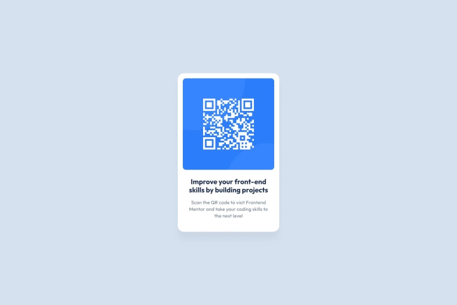
Design comparison
Community feedback
- @JuarrisonPosted about 2 years ago
Hi @patidarmk. Good work! I suggest you try a few small changes. First, the background color proposed by the challenge is hsl(212, 45%, 89%). On the other hand, the card title font should have another font ('Outfit', sans-serif;). Finally, I think you could explore some semantic HTML tags like <article>, <footer>, among others. Here is some interesting documentation about it: https://www.w3schools.com/html/html5_semantic_elements.asp Greetings. I hope all this will be useful to you on this path of web development.
0 - @romila2003Posted about 2 years ago
Hi Mukesh,
Welcome to the frontend mentor community and congratulations 🎉 for completing this challenge, it was a great attempt. I found some issues I want to address:
- It is best practice to wrap the main content within the
maintag which would ensure that your content is wrapped within the correct landmarks e.g.<main class="container"></main> - You should also wrap the footer within the
footertag e.g.<footer class="attribution"></footer> - Your texts are missing the correct
font-familywhich are provided within the style-guide - Also, the color for the title and description are also provided within the style-guide therefore it would be better to use the style-guide as a guide to recreate the design provided using the correct properties.
- Instead of using the
marginproperty to position the card, you can center the card by using theflexproperty on the body e.g.
body {
  display: flex;
  align-items: center;
  justify-content: center;
  min-height: 100vh;
  flex-direction: column;
}
Overall, great attempt and wish you the best for your future projects so keep coding 👍.
0 - It is best practice to wrap the main content within the
Please log in to post a comment
Log in with GitHubJoin our Discord community
Join thousands of Frontend Mentor community members taking the challenges, sharing resources, helping each other, and chatting about all things front-end!
Join our Discord
