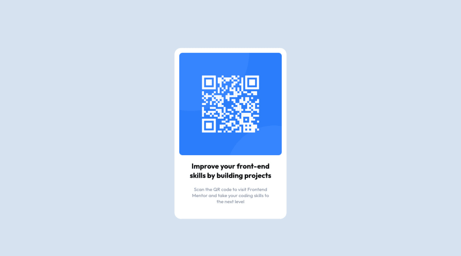
Design comparison
Community feedback
- @correlucasPosted over 2 years ago
👾Hello @DaliborStolarski, congratulations for your first solution and 😎 welcome to the Frontend Mentor Coding Community!
Your solution is already perfect and working fine.
You can improve it and make the code cleaner with a simple approach, removing unnecessary divs, all you need is a single
<main>or<div>to keep all the content inside, and nothing more. The ideal structure is thedivand only the image, heading and paragraph.See the structure below:
<body>
<main>
<img>
<h1></h1>
<p></p>
</main>
</body>
Here's my solution for this challenge if you wants to see how I build it: https://www.frontendmentor.io/challenges/qr-code-component-iux_sIO_H/hub/qr-code-component-vanilla-cs-js-darklight-mode-nS2aOYYsJR
👋 I hope this helps you and happy coding!
Marked as helpful0
Please log in to post a comment
Log in with GitHubJoin our Discord community
Join thousands of Frontend Mentor community members taking the challenges, sharing resources, helping each other, and chatting about all things front-end!
Join our Discord
