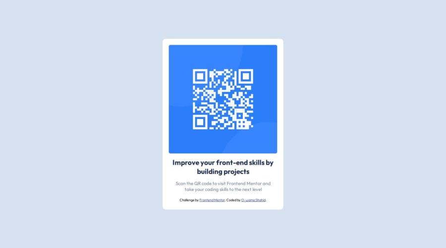
QR-code-component for the practice of Basic HTML&CSS
Design comparison
Community feedback
- @imxeonPosted 6 months ago
First thing - remove the attribution from the bottom of the card, the goal is to make similar or exact design to the reference. The reference design does not contains it.
-
The solution does not include semantic elements. Include elements like
main,sectioninstead of usingdiveverywhere for better accessibility. -
It is recommended to use lowercase for CSS selector names. Replace the capital H in this line
<div class="Heading">with lowercase h. -
You should use the type selector
h2directly in the stylesheet to target the element instead of using inline styling -<h2 style="padding:0;margin:0;display:flex;">Improve your front-end skills by building projects</h2>this will result is better readability of the code.
1@MrOsamashahidPosted 6 months ago@imxeon thank uh so much for the guidance pls check more flaws and also gimme tips
0 -
Please log in to post a comment
Log in with GitHubJoin our Discord community
Join thousands of Frontend Mentor community members taking the challenges, sharing resources, helping each other, and chatting about all things front-end!
Join our Discord
