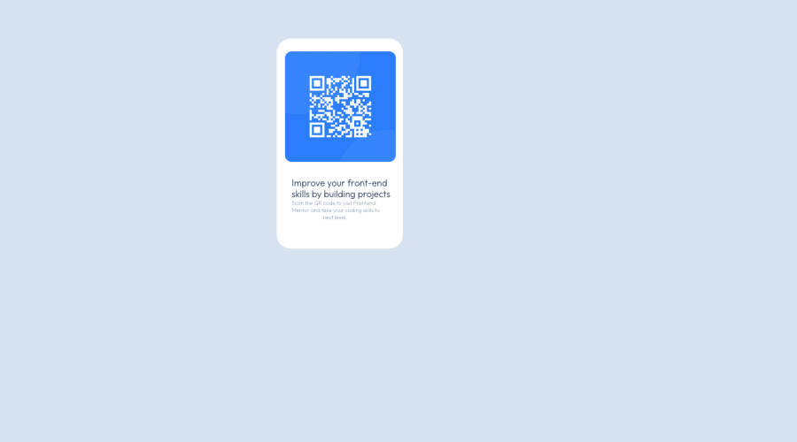
Design comparison
Community feedback
- @HassiaiPosted over 1 year ago
Replace <div class="q-text"> with the main tag , <span class="b-t"> with <h1> and <span class="s-t"> with <p> to fix the accessibility issues. click here for more on web-accessibility and semantic html
There is no need for <br> in the html.
To center .qr-text on the page using flexbox or grid instead of margin, add min-height:100vh; display: flex; align-items: center: justify-content: center; or min-height:100vh; display: grid place-items: center to the body.
USING FLEXBOX:
body{
min-height: 100vh;
display: flex;
align-items: center;
justify-content: center;
}
USING GRID: body{ min-height: 100vh; display: grid; place-items: center; }For responsive content, replace the width in .qr-text with max-width and increase it value, give it a padding value for all the sides
max-width: 320px padding: 16pxand give the imgmax-width: 100%and a border-radius value.Give h1 and p the same font-size of 15px which is 0.9375rem, text-align: center,the same margin-left, margin-right and margin-top values. Give p a margin bottom value.
Use relative units like rem or em as unit for the padding, margin, width values and preferably rem for the font-size values, instead of using px which is an absolute unit. For more on CSS units Click here
Hope am helpful.
Well done for completing this challenge. HAPPY CODING
Marked as helpful0
Please log in to post a comment
Log in with GitHubJoin our Discord community
Join thousands of Frontend Mentor community members taking the challenges, sharing resources, helping each other, and chatting about all things front-end!
Join our Discord
