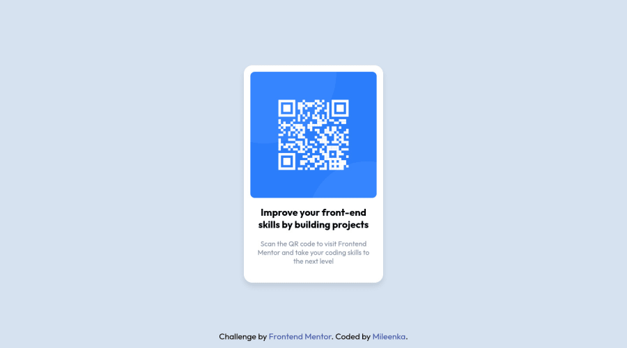
Design comparison
Community feedback
- @correlucasPosted about 2 years ago
👾Hello Mileenka, Congratulations on completing this challenge!
Great solution and great start! By what I saw you’re on the right track. I’ve few suggestions to you that you can consider to add to your code:
1.You’ve used
<div>to wrap the card container, in this case you need to use<main>since this is the main block of this page.2.It's even better to use
relative unitsasremoremthat have a better fit if you want your site more accessible between different screen sizes and devices.REMandEMdoes not just apply to font size, but to all sizes as well.3.It is not advisable to use IDs as CSS selectors because if another element in the page uses the same/similar style, you would have to write the same CSS again. Even if you don't have more than one element with that style right now, it might come later.
4.The html structure is fine and works, but you can reduce at least 20% of your code cleaning the unnecessary elements, you start cleaning it by removing some unnecessary
<div>. For this solution you wrap everything inside a single block of content using<div>or<main>(better option for accessibility) and put inside the whole content<img>/<h1>and<p>.<body> <main> <img src="./images/image-qr-code.png" alt="Qr Code Image" > <h1>Improve your front-end skills by building projects</h1> <p>Scan the QR code to visit Frontend Mentor and take your coding skills to the next level</p> </main> </body>✌️ I hope this helps you and happy coding!
Marked as helpful1@MileenkaPosted about 2 years ago@correlucas Hi again, All corrected by following your instructions. I converted px to rem, reduced the code, replaced div with main and id to class.
I wish you a good day :)
1
Please log in to post a comment
Log in with GitHubJoin our Discord community
Join thousands of Frontend Mentor community members taking the challenges, sharing resources, helping each other, and chatting about all things front-end!
Join our Discord
