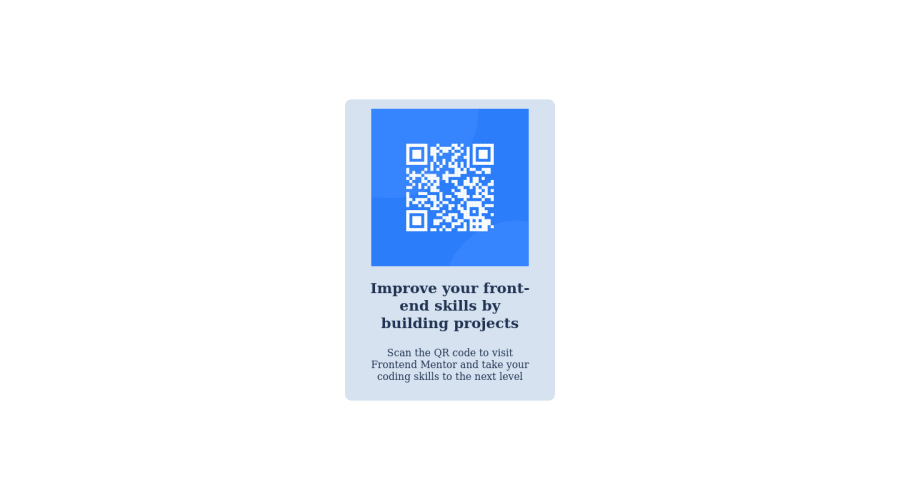
Design comparison
SolutionDesign
Community feedback
- @MelvinAguilarPosted about 2 years ago
Hi @ipresley96 👋, good job on completing this challenge! 🎉
I like this solution for the challenge. I have outlined a few recommendations that you could take into account to further improve the solution and for future challenges.
- Use
min-height: 100vhtobodyselector, with this property you set a height and you let the element grow even more if necessary. - Use
margin: 0.938remormargin: 15pxin the.containerselector so that it has some space when viewed on mobile devices. - It's recommended to use the semantic tag main. Click here for more information.:
<body>
   <main class="container">
      . . .
   </main>
<body>
I hope those tips will help you.
Good job, and happy coding!
1 - Use
Please log in to post a comment
Log in with GitHubJoin our Discord community
Join thousands of Frontend Mentor community members taking the challenges, sharing resources, helping each other, and chatting about all things front-end!
Join our Discord
