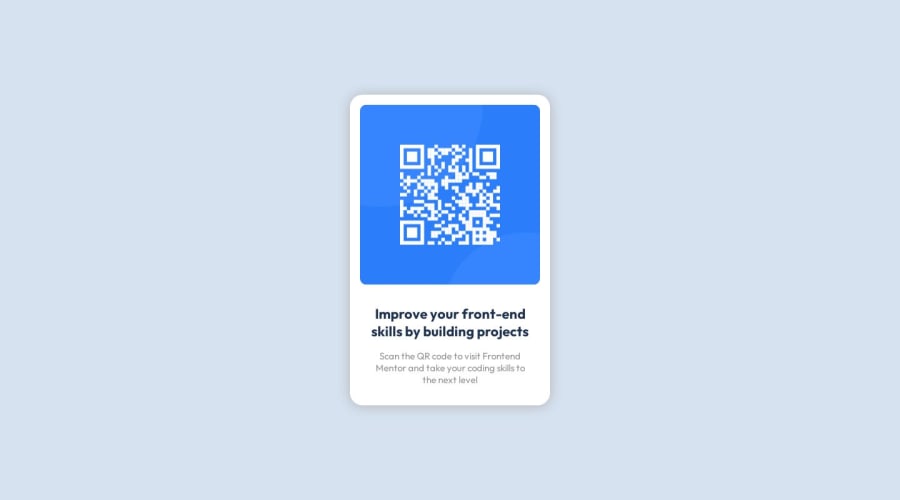
Design comparison
SolutionDesign
Solution retrospective
What are you most proud of, and what would you do differently next time?
I was most proud of being able to center the card in the middle of the page. Next time I would take some time to figure out sizing and related matters.
What challenges did you encounter, and how did you overcome them?I had some challenges centring the card. To solve this issue I googled the problem and read several blogs that explained how to overcome the issue.
What specific areas of your project would you like help with?If there is anything wrong (apart from the size 😭) just let me know!
Community feedback
Please log in to post a comment
Log in with GitHubJoin our Discord community
Join thousands of Frontend Mentor community members taking the challenges, sharing resources, helping each other, and chatting about all things front-end!
Join our Discord
