Design comparison
Community feedback
- @loganbriggs08Posted over 1 year ago
Hey, Your QR Code component looks great however i have a few suggestions to improve it even more!
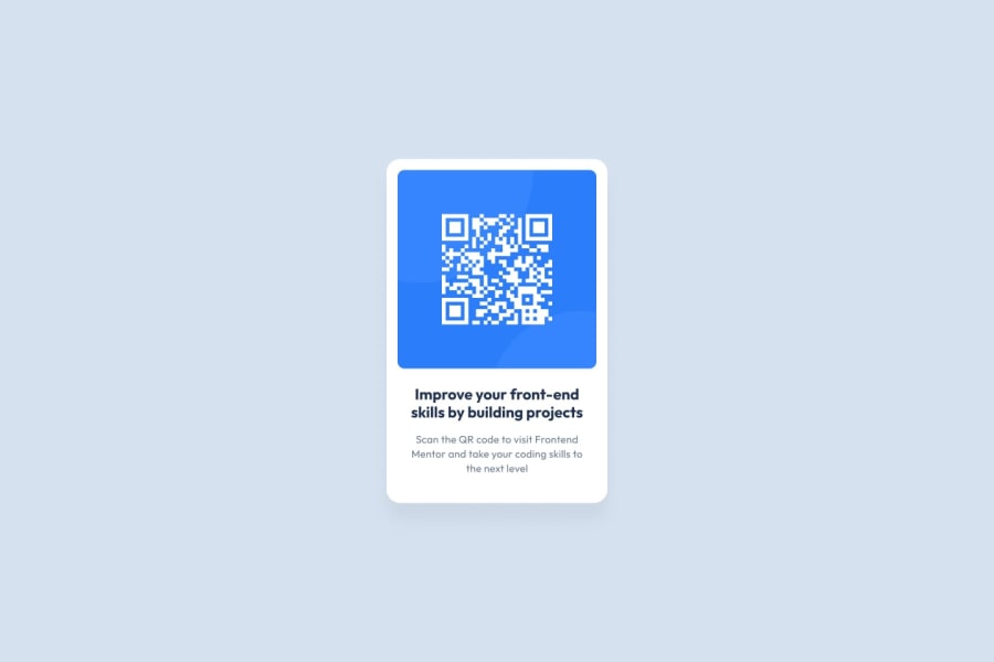
My first suggestion is that you make your card a little bit smaller and don't make it fit the full screen so it can then be centred more like the original frontendmentor design, this can easily be done and will make your component look even better.
My second suggestion is that you change the font sizing of your second text (the description) to make it smaller like the original example.
Doing these two things will make your component even better and challenge you even more.
If you need help doing any of this let me know and ill send you some code to help you and links if needed.
Anyways enjoy : )
1 - @islamabozeedPosted over 1 year ago
thanks for your comments, it's really helpful hope if you can send me a code example so I can fully understand your points thanks again
0
Please log in to post a comment
Log in with GitHubJoin our Discord community
Join thousands of Frontend Mentor community members taking the challenges, sharing resources, helping each other, and chatting about all things front-end!
Join our Discord
