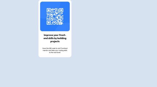
Not Found
Not Found
Not Found
Not Found
Not Found
Not Found
Not Found
Not Found
Not Found
Not Found
Not Found
Not Found
Not Found
Not Found
Not Found
Not Found
Not Found
Not Found
Not Found
Not Found

Submitted

Qr-code-Component

@Olanrewaju-Ak

Desktop design screenshot for the QR code component coding challenge

This is a solution for...

  • HTML
  • CSS
1newbie
View challenge

Design comparison


SolutionDesign

Solution retrospective


I found centering the qr code in the middle of the page very challenging even though I used flexbox. I will appreciate anyone who can review my code and point out what I have done wrong

Community feedback

Account Deleted

Hey Olanrewaju, congratulations on completing the challenge! You did a good work πŸ˜‰

Let me give you some little tips for optimizing your code:

  • remove all margin from container class and set width: 22rem
  • use flexbox to the body to center the card. Read here -> flex guide
  • after, add min-height: 100vh to body because Flexbox aligns child items to the size of the parent container
  • instead of using px use relative units of measurement like rem -> read here

Hope this help 😁 by Travolgi

Marked as helpful

0

@Olanrewaju-Ak

Posted

@travolgi thank you for your feedback. It worked

1

Account Deleted

@Olanrewaju-Ak You are welcome! Keep it up :)

0
Vanza Setiaβ€’ 27,795

@vanzasetia

Posted

Hello, Olanrewaju Akinola! πŸ‘‹

Congratulations on finishing this challenge! πŸ‘

The link to the project repository is giving me a 404 page. I assume that you make the repository a private repository. So, I recommend making it a public repository. This will make it easier for other mentors to give feedback on your code.

Regarding your question, I recommend using flexbox. I suggest trying to make the body element a flex container. After that, set min-height: 100vh to it. This will make the card horizontally and vertically centered on any screen size. Not only that but also it still allows the body element to have more height if the content needs more than 100vh.

Also, it's possible to make the site completely responsive without any media queries. The only thing that the card needs to be responsive is a max-width to prevent the card filling the entire page.

That's it! I hope this helps. 😊

Marked as helpful

0

@Olanrewaju-Ak

Posted

@vanzasetia Thank you, i have made the repository public now. You should be able to view it. thanks for your advise on centering the body with flexbox and the media queries. I will apply the corrections

1
Lesley Kimutaiβ€’ 565

@Leskim

Posted

Hey Akinola ... first removew the width:70vw on your body coz that's messing things for you. Then use one width percentage on the .container like your width:80% and set a max-width: 450px of a fixed value. This will enable you scrub off the @media queries you have.

To center it you were thereπŸ‘πŸΎ with margin:auto just add a bit of top margin margin: 5rem auto to get it from the top of the page.

Hope this helps

Marked as helpful

0

@Olanrewaju-Ak

Posted

@Leskim thank you for your comments. i'll try and apply your corrections

0
Vanza Setiaβ€’ 27,795

@vanzasetia

Posted

@Leskim Setting width: 80% can make the card looks very small on small devices. So, I suggest only setting max-width. πŸ™‚

1
Lesley Kimutaiβ€’ 565

@Leskim

Posted

@vanzasetia Yeah .. πŸ˜… it will be one of the smallest cards ever on mobile Thanks 🀝🏾

1

Please log in to post a comment

Log in with GitHub
Discord logo

Join our Discord community

Join thousands of Frontend Mentor community members taking the challenges, sharing resources, helping each other, and chatting about all things front-end!

Join our Discord