

Design comparison

Solution retrospective
All review is welcomed,Thank you.
Community feedback
- @istealersn-devPosted almost 2 years ago
Great efforts! Congratulations on completion of the challenge
When you build HTML, its important that you get the semantics right as that boost accessibility and SEO aspect. In your HTML structure you are missing some important aspects like making sure to include
<main>tag inside body specifying that its the main content of the body and including at least one<h1>is mandate as per web standards.On the CSS end, I see you've used a mix of
pxandrem, as a best practise I will recommend to stick toreminstead of pixels as that will enable good support for user specific browser preferences and accessibility. It uses a base size: 16 (default font size) however you can override that by specifying the root font size withinhtmltag in CSS, something like this:html { font-size: 15px; }- this will automatically calculate your pixels based on you the rem values you set.Hope this is helpful!
Marked as helpful0 - @TanDevvPosted almost 2 years ago
Good job on this, alexanderokeagu. I have a few suggestions for ya :)
-
Try placing your container in a
maintag afterbodyfor more semantic HTML. -
You skipped
h1entirely and went straight toh2, unfortunately it is not good practice to skip levels of heading, especially the h1 as this tells visual-impaired users what the whole page even is. You can always put a h1 in a landmark like main and set it to be visually hidden so it does not show up in the page but it is still read out by screen-readers. -
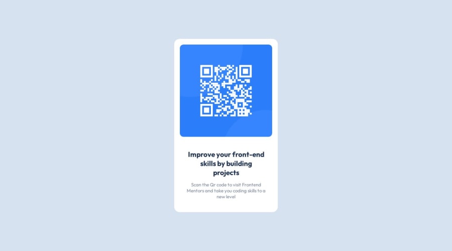
Your
alttext "Your image here" does not make much sense in this context, consider changing it to"QR code to Frontendmentor.io"so someone with a screen-reader can better understand what the image is doing to the website. -
Try to avoid using
pxunits for pretty much anything, unless you are using decorative properties like borders, box shadow etc.. and want something to look more precise, px units do not scale well when it comes to accessibility features in browsers like zooming in and out. I suggest looking into theremandemunits.
Here are some references if you feel inclined to read them!
Visually Hidden elements via Webaim
"Are you using the right CSS units?" via Kevin Powell on Youtube
Marked as helpful0 -


Please log in to post a comment
Log in with GitHubJoin our Discord community
Join thousands of Frontend Mentor community members taking the challenges, sharing resources, helping each other, and chatting about all things front-end!
Join our Discord