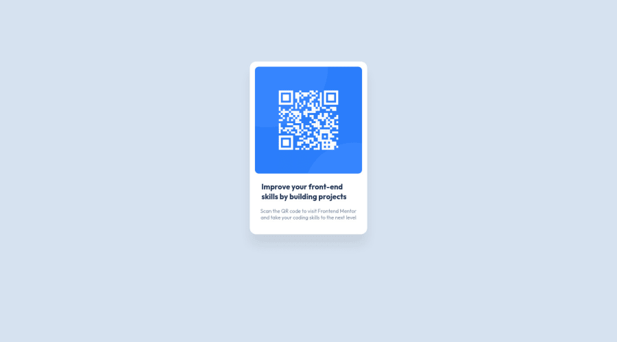
Design comparison
Solution retrospective
My biggest concern with my projects ( I have done others) is I always feel I can write less code, essentially do more with less.
Community feedback
- @PhoenixDev22Posted about 2 years ago
Hi ColonelSandurz,
Congratulation on completing your first frontend mentor challenge.
Excellent work! I have some suggestions regarding your solution:
- Use
<main>
landmark to wrap the card. HTML5 landmark elements are used to improve navigation experience on your site for users of assistive technology.
- Page should contain
<h1>
. In this challenge , as it’s supposed to be a part of a whole page, you may use<h1>
withsr-only
class hidden visually and present for assistive tech users. And then use<h2>
instead of<h3>
.
- In my opinion, the alternate text is needed on this image. The alternate text should indicate where the Qr code navigate the user : like
QR code to frontend mentor
not describes the image. The alternate text should not be hyphenated, it should be human readable.
- In order to center the card on the middle of the page , you can use the flexbox properties and
min-height: 100vh
for the<body>
add a little padding to the body that way it stops the card from hitting the edges of the browser. Then you can remove absolute positioning .
width: 19%;
using percentage for widths alone causes to lose control of the layout . consider usingmax-width
to the card inrem
instead .
- Consider using rem and em units as they are flexible, specially for font size better to use rem. If your web content font sizes are set in absolute units, such as pixels, the user will not be able to re-size the text or control the font size based on their needs. Relative units “stretch” according to the screen size and/or user’s preferred font size, and work on a large range of devices.
- Remember a css reset on every project. That will do things like set the images to display block and make all browsers display elements the same.
- Using percentages for widths, using max-width and avoiding to set heights for the components, with these things is the key to mastering responsive layouts.
- It's recommended to include a git ignore. This came with your starter files. It's less important in this challenge but will become extremely important as you move onto larger projects with build steps.
Overall, Your solution is good. Hopefully this feedback helps.
Marked as helpful0@ColonelSandurzPosted about 2 years ago@PhoenixDev22 Thank you, these are all very helpful suggestions
1@PhoenixDev22Posted about 2 years ago@ColonelSandurz Glad it was helpful. Happy coding!
0 - Use
- @correlucasPosted about 2 years ago
👾Hello Colonel, congratulations for your new solution!
Your solution is just great and I can tell you that you've used the minimum code possible for the
html structure
. This is amazing. That means a div to hold all the content -->div - img - h1 - p
If you wants to clean the code even more, delete all the
class
and use the direct selector for each element to manipulate the css. For example:img, h1, p, div
.👋 I hope this helps you and happy coding!
Marked as helpful0@ColonelSandurzPosted about 2 years ago@correlucas Thanks! I will try that on the next challenge
0
Please log in to post a comment
Log in with GitHubJoin our Discord community
Join thousands of Frontend Mentor community members taking the challenges, sharing resources, helping each other, and chatting about all things front-end!
Join our Discord