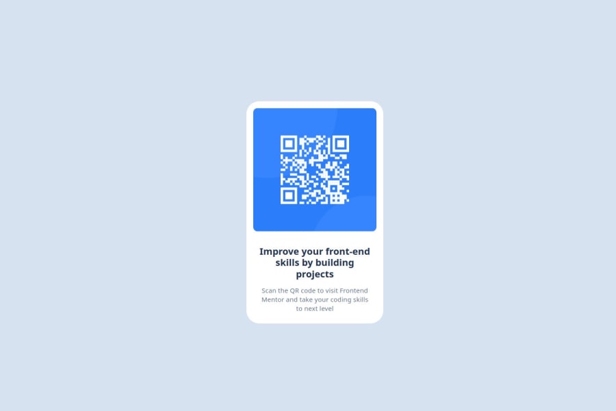
Design comparison
Solution retrospective
I’m proud of getting close to the design. Next time, I’ll focus on getting it perfect.
What challenges did you encounter, and how did you overcome them?I faced challenges with spacing between elements. I overcame this by experimenting with different methods until I found a solution that worked.
What specific areas of your project would you like help with?In the Figma file, the text size for "Improve your front-end skills by building projects" is set to 22px. However, when I adjust the size to 22px, the alignment shifts and does not match the design as specified. I have currently kept it at 20px to maintain alignment.
I would appreciate assistance in setting the text size to 22px while ensuring proper alignment consistent with the Figma design.
Community feedback
- @SvitlanaSuslenkovaPosted 7 months ago
It looks good. But you don't need div for every <p> element. <p> is already a block as it is, (p {display: block}), add margins, paddings and so on to it. Also your <p> elements are in same flow, inside one container, it's better not to give them height: px, it can cause a lot of problems. You have line-height, margin, padding, letter-spacing and so on.
Marked as helpful0
Please log in to post a comment
Log in with GitHubJoin our Discord community
Join thousands of Frontend Mentor community members taking the challenges, sharing resources, helping each other, and chatting about all things front-end!
Join our Discord
