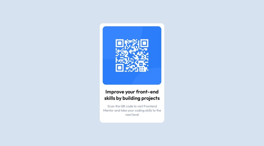
Design comparison
SolutionDesign
Solution retrospective
What are you most proud of, and what would you do differently next time?
[+] The design looks almost the same as the desired outcome.
What challenges did you encounter, and how did you overcome them?[-] Setting up the proper dimensions of the QR code card was a bit tedious. I used a new concept that I have recently learned which is setting the width with the help of the max() function.
What specific areas of your project would you like help with?[-] I have not learned how to make the layout responsive on mobile yet.
Please log in to post a comment
Log in with GitHubCommunity feedback
No feedback yet. Be the first to give feedback on tanasegabrielw's solution.
Join our Discord community
Join thousands of Frontend Mentor community members taking the challenges, sharing resources, helping each other, and chatting about all things front-end!
Join our Discord
