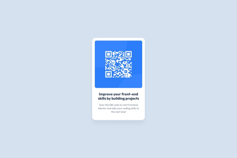
Design comparison
SolutionDesign
Community feedback
- @ChoconaldoPosted 8 months ago
It's pretty good in general. I think you should get rid of the text below the card and check the the text format below the title. It takes three lines, not two like your solution.
0
Please log in to post a comment
Log in with GitHubJoin our Discord community
Join thousands of Frontend Mentor community members taking the challenges, sharing resources, helping each other, and chatting about all things front-end!
Join our Discord
