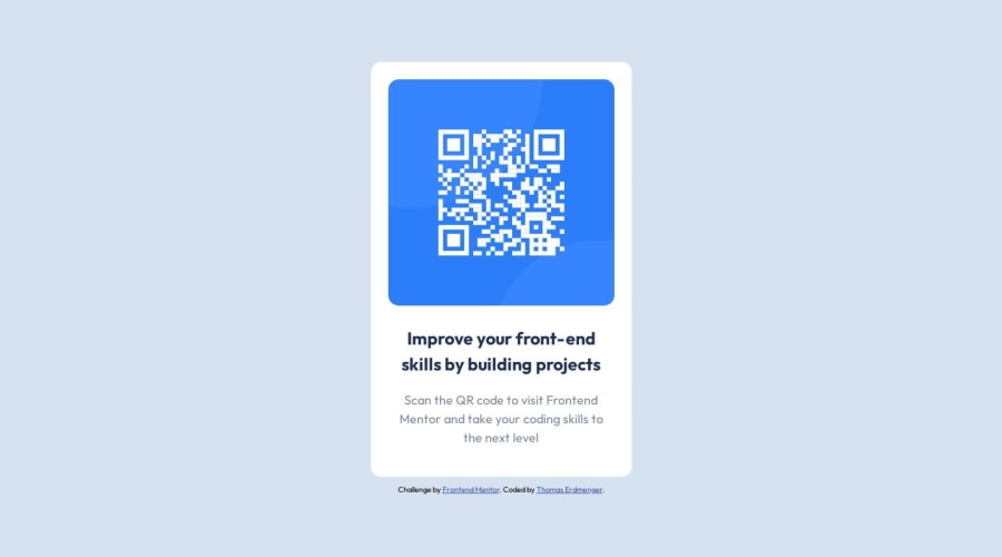
QR-Code-Challenge solution using Flexbox
Design comparison
Solution retrospective
The designs should have been built with the following widths: mobile: 375px and desktop: 1440px. As of I don't think this makes sense since I centered the design and it is centered in both widths. I am wrong with that?
For me it was hard to center the container. My solution was to set the height to 100vh. Is this ok or is there a better solution?
I thank you for any further advice.
Community feedback
- @0xabdulkhaliqPosted over 1 year ago
Hello there 👋. Congratulations on successfully completing the challenge! 🎉
- I have other recommendations regarding your code that I believe will be of great interest to you.
COMPONENT MEASUREMENTS 📐:
- Use
min-height: 100vhformaininstead ofheight: 100vh. Setting theheight: 100vhmay result in the component being cut off on smaller screens such as mobile phones in landscape orientation.
- For example; if we set
height: 100vhthen themainwill have100vhheight no matter what. Even if the content spans more than100vhof viewport.
- But if we set
min-height: 100vhthen themainwill start at100vh, if the content pushes themainbeyond100vhit will continue growing. However if you have content that takes less than100vhit will still take100vhin space.
.
I hope you find this helpful 😄 Above all, the solution you submitted is great !
Happy coding!
0@thomaserdmengerPosted over 1 year ago@0xAbdulKhalid Thank you for your advice!
0@0xabdulkhaliqPosted over 1 year ago@thomaserdmenger Glad you found it helpful ! 🤠
0
Please log in to post a comment
Log in with GitHubJoin our Discord community
Join thousands of Frontend Mentor community members taking the challenges, sharing resources, helping each other, and chatting about all things front-end!
Join our Discord
