Design comparison
SolutionDesign
Solution retrospective
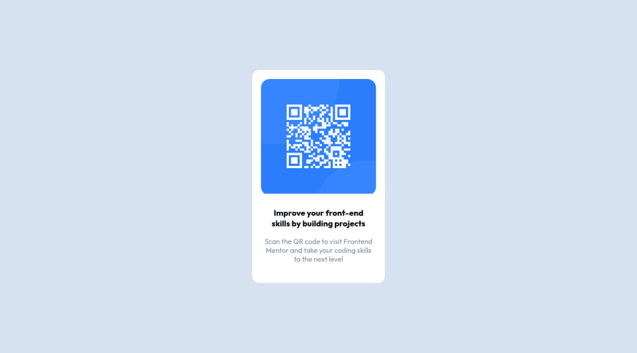
Here is my own solution to the qr-code challenge
Community feedback
- @PhoenixDev22Posted over 2 years ago
Hi @Tamunopreye,
Congratulation on completing this frontend mentor challenge. Your solution looks great. I have some suggestions regarding your solution:
- You should use
<main>landmark to wrap the card. HTML5 landmark elements are used to improve navigation experience on your site for users of assistive technology.
- Page should contain
<h1>. In this challenge , as it’s supposed to be a part of a whole page, you may use<h1>withsr-onlyclass hidden visually and present for assistive tech users. Then you can use<h2>instead of<h3>.
- In my opinion, the alternate text is needed on this image. The alternate text should indicate where the Qr code navigate the user : like
QR code to frontend mentornot describes the image. The alternate text should not be hyphenated , it should be human readable.
- There are some unnecessary div’s should be removed.
Overall, Excellent work! Hopefully this feedback helps.
Marked as helpful0@TamunopreyePosted over 2 years ago@PhoenixDev22 Thank you. Your suggestion were good i'll take note of it for even future references and i will use more of
HTML5too, thank you i'll make the necessary corrections.1@PhoenixDev22Posted over 2 years ago@Tamunopreye Glad it was helpful.Happy coding!
0 - You should use
Please log in to post a comment
Log in with GitHubJoin our Discord community
Join thousands of Frontend Mentor community members taking the challenges, sharing resources, helping each other, and chatting about all things front-end!
Join our Discord
