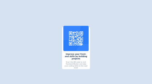
Design comparison
Solution retrospective
Is the architecture of my code better than my previous project (card_preview) ?
I don't really know how to adapt the width of my page to the screen, could you give me some advice please ?
Is there any bad habits on my code ?
Thanks for your feedbacks ! I understand really quickly thanks to you !
Community feedback
- @AdrianoEscarabotePosted about 2 years ago
Hi @LucatoNine, how are you?
You did a great job on this challenge, but I have a few tips I think you'll like:
1- Page should contain a level-one heading, you could have changed
h3
toh1
click here2- Document should have one main landmark, you could have put all the content inside the
main
tag click herefor the project to have a better responsiveness I made some changes:
body { max-width: 265px; width: 100%; }
.pict { max-width: 240px; width: 100%; }
The rest is great! Hope it helps... 👍
Marked as helpful0 - @Chris-aiPosted about 2 years ago
I have small advice about fonts. You can import them just with one link in your html. Look here
Also wrap your code in some containers. Not let them just be mess in <body>.
For example:
<container> ... your code ... </container>
0 - @them7dPosted about 2 years ago
you can use
width:100%; and height:100hv;
or width:100vw; and height:100hv; on body
to adapt width and height page
in additional move style of html to the body and style body to div contain (img,h3,paragraph) check html code this page: https://them7d.github.io/qr-card
0
Please log in to post a comment
Log in with GitHubJoin our Discord community
Join thousands of Frontend Mentor community members taking the challenges, sharing resources, helping each other, and chatting about all things front-end!
Join our Discord