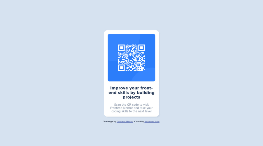
Design comparison
Community feedback
- @AdamMzkrPosted over 2 years ago
Hi, it's something wrong with your mobile view check these and fix. Your card in mobile view have too small width. And it's no sense to make a new css file to display mobile view if this css file contains 1 line of code
I hope it will be helpfull
Marked as helpful1@mohamedAbouzidPosted over 2 years ago@AdamMzkr thanks for this support, but I have a question about something confuses me till now!! How I could benefit from the information below "style guide file"? ## Layout The designs were created to the following widths: - Mobile: 375px - Desktop: 1440px
0@AdamMzkrPosted over 2 years ago@mohamedAbouzid you can check how your website look like in this dimensions of screen. You can use developer tools in browser and check this. Also screenshot is make form 1440 PX
0 - @keisewarsamePosted over 2 years ago
Hey @MmohamedAbouzid, way to go on this challenge! Looks good except for one minor thing that I would change:
- Increase your border radius to your container and img to make it look more like the actual challenge. It supposed to be more rounder on the corners
- Decrease the size of your image a bit
Marked as helpful0
Please log in to post a comment
Log in with GitHubJoin our Discord community
Join thousands of Frontend Mentor community members taking the challenges, sharing resources, helping each other, and chatting about all things front-end!
Join our Discord
