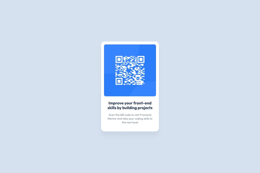
QR-code widget for mobile and desktop users (Frontend Mentor starter)
Design comparison
Solution retrospective
- Is the color/font design scheme complete for this question? It was not clear to me what the color of the font for the detail text should be (I chose the provided blue-grey, but it does not match the design template).
Community feedback
- @StephenYu2018Posted over 1 year ago
Check your CSS color values again. The style guide states that grayish blue is
hsl(220, 15%, 55%), but you have:body { ... color: hsl(218, 44%, 55%); }So it would have seemed that you used the saturation for dark blue in the place of the saturation for grayish blue. You've also used the lightness for grayish blue in the place of the lightness for dark blue.
To improve your odds of avoiding these types of mix-ups, it helps to use CSS variables to assign names to values. This keeps those styles in one place and gives that color a connection to the style guide. For example, you could have:
:root {
  --white: hsl(0, 0%, 100%);
  --light-gray: hsl(212, 45%, 89%);
  --grayish-blue: hsl(220, 15%, 55%);
  --dark-blue: hsl(218, 44%, 22%);
}
And then you could use the variables throughout your CSS:
body {
  ...
  color: var(--dark-blue);
}

main {
  background-color: var(--light-gray);
  ...
}
...
.modal {
  background-color: var(--white);
}
...
.subtitle {
  ...
  color: var(--dark-blue);  // Not hsl(255, 100%, 0%)
  ...
}
...
@media only screen and (min-width: 500px) {
  main {
    background-color: var(--light-gray);
    ...
  }
  ...
}
This reduces code duplication, makes your code more readable, and keeps the values that need to change for a single reason together. If any of your colors don't look correct for any reason, you could always look at the variable name used, then go to
:rootto see what color value it was assigned. All your color values are kept in one place (being:root) and you can fix all instances of the same bug wherever the color is used.For your text not being in the correct font family, double-check to make sure that you copied the all the proper HTML tags from Google Fonts to your
index.html. There are usually 3 different <link> tags for you to copy, not just 1.Also, there's no styles provided for the
.descriptionclass. Check to make sure you have them in your CSS files on your device. And if you already do, then it's likely that you didn't commit them to git properly, or it didn't get pushed properly to GitHub.Marked as helpful2 - @taco-nekoPosted over 1 year ago
Yes, the color and font scheme is complete.
Checking your code, you didn't set a colour on the subtitle, and it inherited the body's colour. That's why it looks wrong.
I recommend making all colours into custom properties, so you can reuse them and not have to worry about accidentally making a typo or using the wrong one.
This is how I set it up in my file:
:root {
    --white: 0, 0%, 100%;
    --light-gray: 212, 45%, 89%;
    --grayish-blue: 220, 15%, 55%;
    --dark-blue: 218, 44%, 22%;
}
Then I call them by writing
hsl(var(--grayish-blue)). The benefit to this is that you can also adjust the opacity simply by writing in a value like this:hsl(var(--grayish-blue), 0.5).Marked as helpful1@michaelhaafPosted over 1 year ago@taco-neko
That nested
hsl(var(--))technique for adding opacity is excellent, I had not seen that before. Thanks!Is it fair to say, though, that inferring the opacity of the subtitle description means that the font color scheme is incomplete? (what if the opacity were 0.6 or 0.4, for instance)?
1@taco-nekoPosted over 1 year ago@michaelhaaf No, the opacity is just a little trick I was sharing. I actually used it for the box shadow shown in the original design. You don't have to use it in this project, the --grayish-blue colour is the one you should use for the subtitle.
Marked as helpful1@michaelhaafPosted over 1 year ago@take-neko Nevermind, see @StephenYu's response below; I used a few colors incorrectly.
1
Please log in to post a comment
Log in with GitHubJoin our Discord community
Join thousands of Frontend Mentor community members taking the challenges, sharing resources, helping each other, and chatting about all things front-end!
Join our Discord
