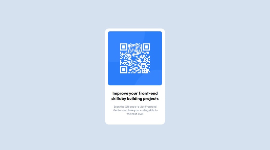
Design comparison
SolutionDesign
Solution retrospective
What are you most proud of, and what would you do differently next time?
- Fighting against git commands figuring out what any of those mean
- Designing something from scratch using figma
- Having patience with git(trust me it was painful)
- Had issues with elements not ligning the way(centering a div)
- referred document for solution
- Had issues with conflicts, branches
- Learned to resolve conficts better and understood git rebase
- Help with git commands, maybe suggest exercises for practice
- Help with when to use grid, flex-box, and when to use position attributes to place elements in html
- Help with git please xD
Community feedback
Please log in to post a comment
Log in with GitHubJoin our Discord community
Join thousands of Frontend Mentor community members taking the challenges, sharing resources, helping each other, and chatting about all things front-end!
Join our Discord
