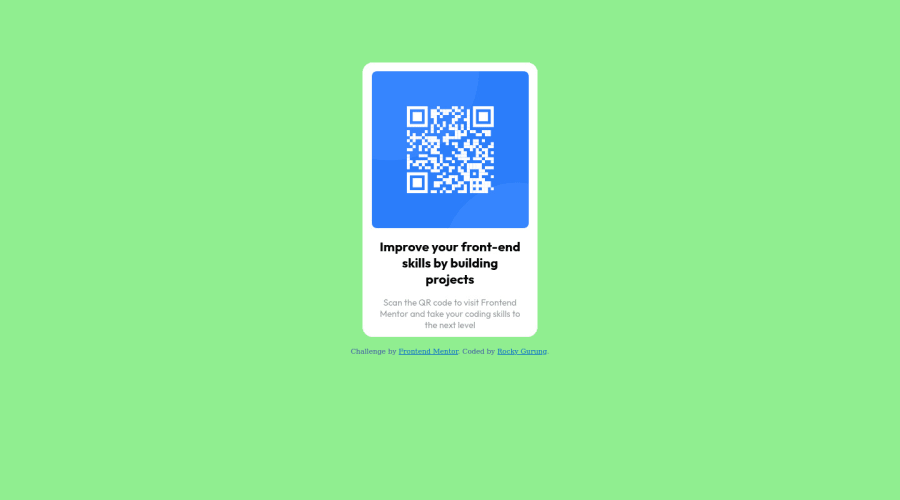
Design comparison
SolutionDesign
Solution retrospective
I used flex layout and used :nth-child() selector to give style to each <p> element. I wonder if it is a long process??
Community feedback
- @OGShawnLeePosted almost 3 years ago
Hey. Good job! Here's my feedback for you mate.
- Yep. You can target both paragraph using a common class and add styles that they share. However you should have not added two paragraphs, instead you could have used an h1 for the big boi and a paragraph for the small one.
- Your markup should have an h1 which would be the one I mentioned.
- You images must have alt attributes, you can leave them empty if the image is used for decoration.
- I think you should have used CSS variables to store the theme from the the style guide.
- For centering your content I would have coded something like this.
body {
  display: flex;
  flex-direction: column;
  align-items: center;
  justify-content: center;
  gap: 7.5rem;
  font-family: 'Outfit', sans-serif; /* apply the font globally here */
  min-height: 100vh;
}
And removed the margin from the #container selector.
Hope this helps mate. Have a great day!
Marked as helpful1@grgrockyPosted almost 3 years ago@OGShawnLee thanks mate, really appreciate your suggestions. Cheers
0
Please log in to post a comment
Log in with GitHubJoin our Discord community
Join thousands of Frontend Mentor community members taking the challenges, sharing resources, helping each other, and chatting about all things front-end!
Join our Discord
