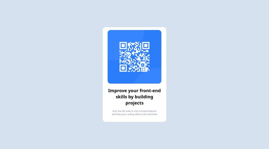
Design comparison
Solution retrospective
I dont think i do anything 'great' here. One thing I learned is definitely flexbox and how to use it the way I wanted it to be.
What challenges did you encounter, and how did you overcome them?I want to create the .container width using relative measurement. I was trying to use the same resolution as the content inside with added padding. I tried fit-content but it seems that the width doesn't fit according to the content inside. So I ended up using absolute measurement
What specific areas of your project would you like help with?I'd like to know how to adjust size according to the content inside. And I want to know which part of my code could be improved according to industry standard.
Community feedback
- @Riska997Posted 11 months ago
There is no source code to view on this project as the GitHub link is non-accessible.
I am unable to to do the review.0
Please log in to post a comment
Log in with GitHubJoin our Discord community
Join thousands of Frontend Mentor community members taking the challenges, sharing resources, helping each other, and chatting about all things front-end!
Join our Discord
