Design comparison
Solution retrospective
Analyse the steps to be done first and then coding.Research more about why this code is being written rather than just knowing if i put this it will work
Community feedback
- @0xbluPosted 4 months ago
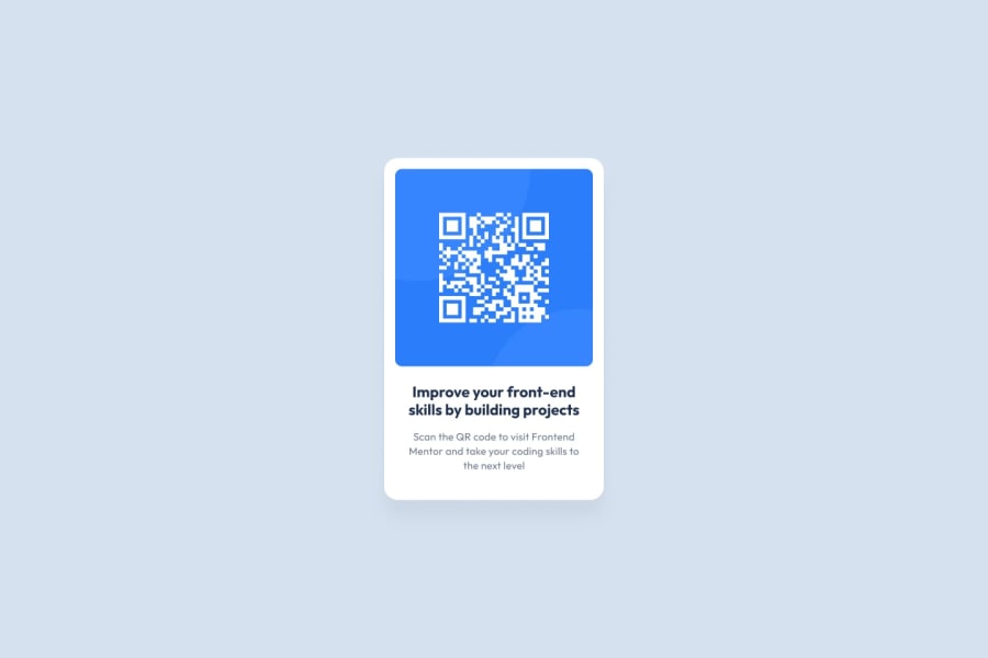
The QR image is a bit smaller compared to the original design and is not entirely readable. Additionally, while the background is similar, it is not the same color.
0 - @dquinn089Posted 4 months ago
Your QR code preview component is well-structured and looks great! While your current design is centered and looks good on most devices, adding media queries will ensure that your component is responsive on all screen sizes. For example:
@media (max-width: 400px) {
  .container {
    width: 90%;
    padding: 20px;
  }
  img {
    width: 100%;
    height: auto;
  }
}
You can enhance readability by using a slightly larger font size and ensuring consistent font usage. Adding more weight to the heading text can also make it stand out more:
body {
  font-family: 'Outfit', sans-serif;
  font-size: 16px;
}
h3 {
  font-size: 1.5em;
  font-weight: 600;
}
p {
  font-size: 1em;
  line-height: 1.5;
}
These changes will help ensure that your project is more adaptable to different devices and more readable. Great job on your project so far! Happy coding!
0
Please log in to post a comment
Log in with GitHubJoin our Discord community
Join thousands of Frontend Mentor community members taking the challenges, sharing resources, helping each other, and chatting about all things front-end!
Join our Discord
