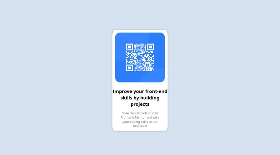
Design comparison
SolutionDesign
Solution retrospective
What are you most proud of, and what would you do differently next time?
Didn't take me long time at all, and haven't written css from scratch before
What challenges did you encounter, and how did you overcome them?First made the CSS for desktop, wasn't sure how to do it well for mobile but think i figured it out?
What specific areas of your project would you like help with?Appreciate feedback on everything!
Community feedback
Please log in to post a comment
Log in with GitHubJoin our Discord community
Join thousands of Frontend Mentor community members taking the challenges, sharing resources, helping each other, and chatting about all things front-end!
Join our Discord
