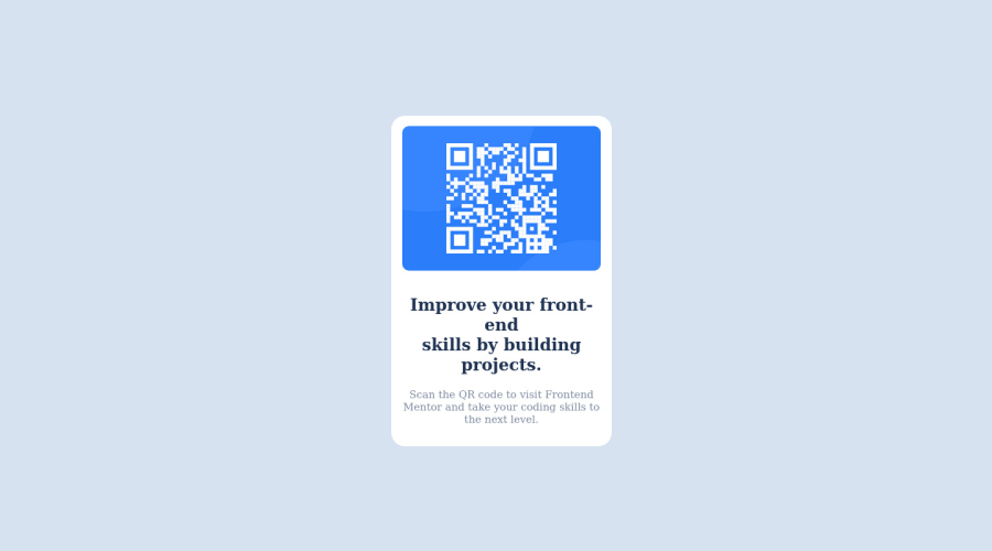
Design comparison
SolutionDesign
Community feedback
- @aviralsharma07Posted over 2 years ago
Hey! Great Work, Here are a few suggestions to improve your Code:
- Use Semantic HTML Tags Like Article instead of section as everything under article has a separate meaning. Before deploying the project use W3 HTML and CSS Validators to avoid syntax errors.
- Write your CSS in a separate file and link it inside
head - Don't use <br> element between Text. Instead, use
min-width:25chaccordingly for text. - Try writing clean code by reducing what is not required. You can remove
divwith the class "qr-wrapper" since you already use the body as a Flex container. - Use an
imgTag and write an alt text for it.
Best of Luck, Hope it helps !!
0
Please log in to post a comment
Log in with GitHubJoin our Discord community
Join thousands of Frontend Mentor community members taking the challenges, sharing resources, helping each other, and chatting about all things front-end!
Join our Discord
