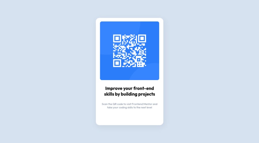
Design comparison
Solution retrospective
What's up people?! Buenas?! Salve! Tjena!
Here is my first submisson here. basic of the basic you gonna make it big.
Please let me know what I could have done better here. Is the flexbox applied in the right way?
Thank you, Gracias, Valeu, tackar!
Community feedback
- @correlucasPosted about 2 years ago
👾Oi Lucas Santos, tudo bem? Parabéns pela sua nova solução!
O seu componente já está com o design pronto, um bom exercício pra melhorar seu código, seria criar a estrutura mais limpa o possível e reduzir seu código ao máximo. Por exemplo, você pode segurar todo conteúdo em um bloco só usando (
<main>
ou<div>
) nesse caso vamos usar<main>
por que é uma tag semantica. Se você notar, nem precisa adicionar nenhum div além da principal pra segurar o conteúdo (img, h1 e p). A estrutura ideal e mais limpa possível pra esse desafio é essa aqui:<body> <main> <img src="./images/image-qr-code.png" alt="Qr Code Image" > <h1>Improve your front-end skills by building projects</h1> <p>Scan the QR code to visit Frontend Mentor and take your coding skills to the next level</p> </main> </body>
Para reduzir o CSS, você pode excluir todas as classes e selecionar todos elementos no CSS com o seletor direto para cada um deles, nesse caso (img, div, main, h1 e p). Faltou também colocar o
alt
text pra imagem ser reconhecida por leitores de tela.👋 Espero que essas dicas te ajudem e que você continue no foco!
Marked as helpful0@FromlukDevPosted about 2 years ago@correlucas Valeu Lucas. To fazendo um curso online e peguei essa mania de criar divs e classes pra quase tudo. Entendi seu ponto! Valeu 👍🏽
1@correlucasPosted about 2 years ago@FromlukDev Qual curso irmão? Tbm to fazendo um, da Origamid.
0@FromlukDevPosted about 2 years ago@correlucas To fazendo com o Mosh Hamedani do codewithmosh.com To curtindo bastante e recomendo. Tu tá fazendo qual curso? to querendo começar um de JavaScript, mas com o mosh fica dificil pelo ingles.
0 - @AdrianoEscarabotePosted about 2 years ago
Hi Lucas Santos, how are you?
Welcome to the front-end mentor community.
I really liked the result of your project, but I have some tips that I think you will like:
I noticed that the page has a scrollbar, to fix this we can do the following:
I took it from the code:
.container { /* margin: 50vh auto; */ /* transform: translateY(-50%); */ }
I added:
body { display: flex; align-items: center; justify-content: center; min height: 100vh; }
The rest is great!!
Hope it helps...👍
Marked as helpful0@FromlukDevPosted about 2 years ago@AdrianoEscarabote Thank you Adriano, I noticed the scrollbar just after I submited my code. The min-height is added now! thanks again 🙏🏽
0
Please log in to post a comment
Log in with GitHubJoin our Discord community
Join thousands of Frontend Mentor community members taking the challenges, sharing resources, helping each other, and chatting about all things front-end!
Join our Discord