Design comparison
Solution retrospective
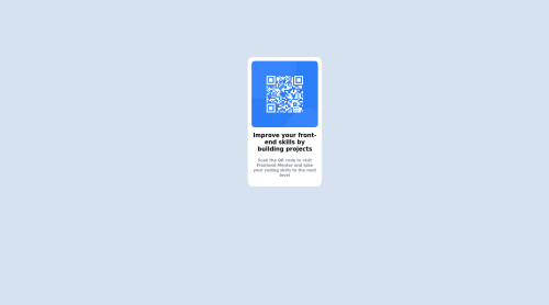
The front-end for desktop layout was manageable to design but I am still not sure how to create it for mobile through the same code. Will really like some help with that!!
Community feedback
- @kirtymeenaPosted over 2 years ago
Hi Aditi, Good work with this challenge
Your div is not in the center, You can use flexbox to center the div
you can read about flexbox here https://css-tricks.com/snippets/css/a-guide-to-flexbox/
you can try this extension called PerfectPixel it will help you create your design pixel perfect.
Keep coding 👍.
Marked as helpful0 - @ChamuMutezvaPosted over 2 years ago
Greetings Aditi. Congratulations for taking your first challenge.
- the challenges come with a skeleton starter file that you can use. In the head of the html, the following is missing
<meta name="viewport" content="width=device-width, initial-scale=1.0">
. Research on it to found out why it should always be included. - use semantic elements such as
main
, where possible instead of divs.
Marked as helpful0 - the challenges come with a skeleton starter file that you can use. In the head of the html, the following is missing
- @AditiChandra18Posted over 2 years ago
Thank you so much for this , I really appreciate it :)
1 - @Julian17xdPosted over 2 years ago
Hi Aditi, I leave you the link to my solved challenge so you can look at it and improve a little. I clarify that it is not the best solution but I hope it can help you in something. https://www.frontendmentor.io/solutions/qr-code-component-pAdliHubr
if the link doesn't work you can go to my profile and look for the solved challenge :)
0@AditiChandra18Posted over 2 years ago@Julian17xd Thank you Julian for the link, I will try mailing it better :)
0
Please log in to post a comment
Log in with GitHubJoin our Discord community
Join thousands of Frontend Mentor community members taking the challenges, sharing resources, helping each other, and chatting about all things front-end!
Join our Discord