Design comparison
Solution retrospective
all feedbacks are welcome
Community feedback
- @ChamuMutezvaPosted almost 3 years ago
Greetings Mortey
There is work to be done especially with the mobile display, this is caused by having margin-inlines of around 10rems on some elements.
Marked as helpful0@MorteyKafuiPosted almost 3 years ago@ChamuMutezva thanks for your comment. am yet to work on the responsiveness
0 - @FluffyKasPosted almost 3 years ago
Hiyo,
It's a good start. I have a few suggestions though:
-
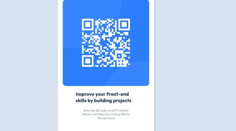
Your component looks really massive. :D Perhaps could be a bit smaller (you also seem to have a massive padding on it, which isn't necessary).
-
If you change the
widthtomax-widthon your image, it would be responsive too :) -
Your title isn't aligned to the center.
-
Instead of giving your heading and
pelements awidth, some inline padding would probably serve you better.
Marked as helpful0 -
Please log in to post a comment
Log in with GitHubJoin our Discord community
Join thousands of Frontend Mentor community members taking the challenges, sharing resources, helping each other, and chatting about all things front-end!
Join our Discord
