

Design comparison
SolutionDesign

Community feedback
- P@kilozdazolikPosted about 2 months ago
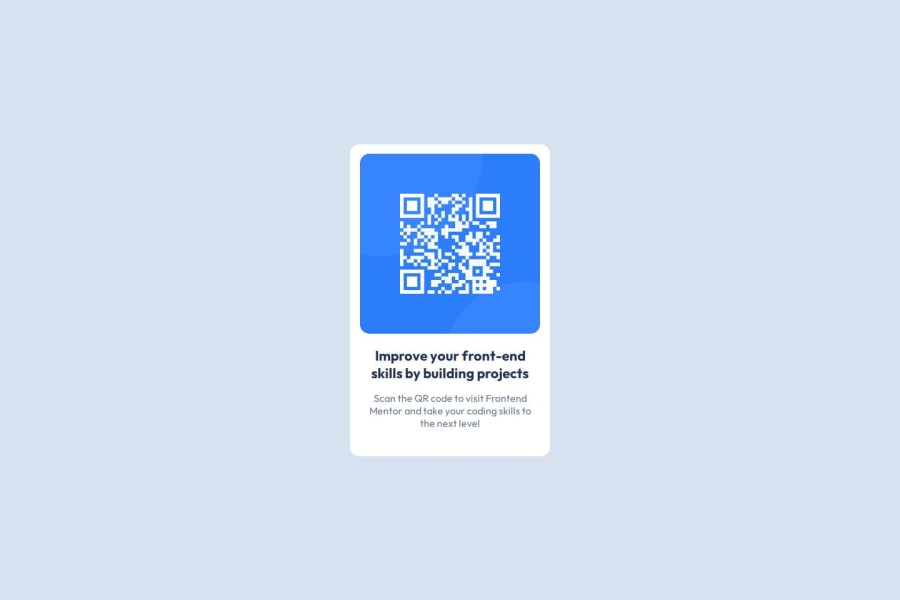
Use a <figure> and <figcaption> for the QR code image since it's a meaningful piece of content.
The text is crucial information, so using a heading (<h1> or <h2>) for the main title would be better for accessibility. Add alt="QR code linking to Frontend Mentor" to clarify what the QR code does.
Instead of padding: 16px; in .improve, use margin-bottom to separate elements more naturally.
Add cursor: pointer; to the QR code image for better UX.
Other than that it looks great! Awesome job!
0

Please log in to post a comment
Log in with GitHubJoin our Discord community
Join thousands of Frontend Mentor community members taking the challenges, sharing resources, helping each other, and chatting about all things front-end!
Join our Discord