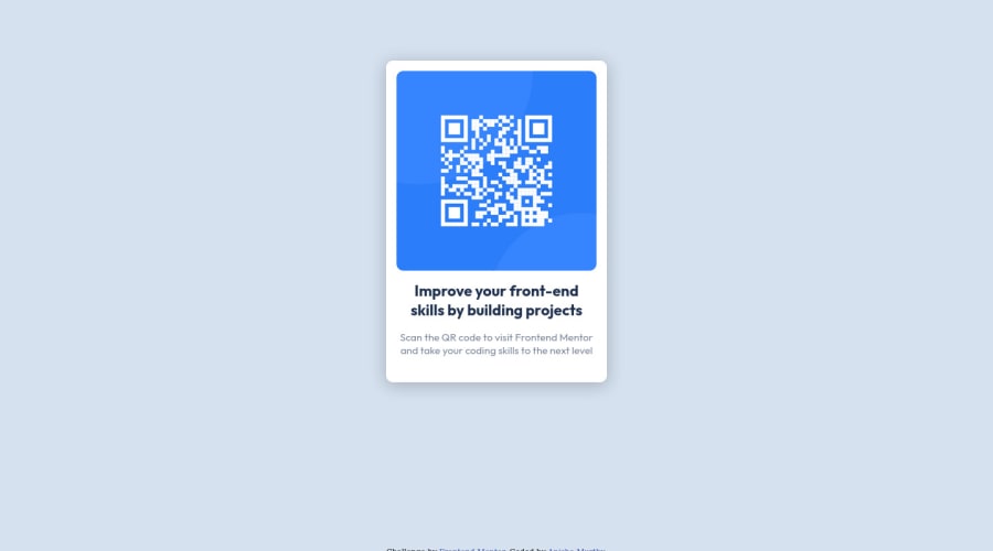
Design comparison
Solution retrospective
Are there any ways to make my code better?
Community feedback
- @g-pgPosted over 1 year ago
To center an element you could try using
display: flex;
justify-content: center;
align-items: center;
on the parent element (the <body>, in your case).
Don't forget to set a height on the parent as well, so it knows what is the center. Normally I already set a "min-height" of 100vh on the body everytime I start a new project.
Marked as helpful2 - @0xabdulkhaliqPosted over 1 year ago
Hello there 👋. Congratulations on successfully completing the challenge! 🎉
- I have some recommendations regarding your code that I believe will be of great interest to you.
CSS 🎨:
- let me explain, How you can easily center the component.
- We don't need to use
marginandpaddingto center the component both horizontally & vertically. Because usingmarginorpaddingwill not dynamical centers our component at all states
- To properly center the component in the page, you should use
FlexboxorGridlayout. You can read more about centering in CSS here 📚.
- For this demonstration we use css
Gridto center the component
body { min-height: 100vh; display: grid; place-items: center; margin: 0; }- And for
footer, apply absolutepositionorfixed. Remember don't forget to remove margins forbody,main
footer { position: absolute; }- Now you can able to see the change
I hope you find this helpful 😄 Above all, the solution you submitted is great !
Happy coding!
Marked as helpful1 - @HassiaiPosted over 1 year ago
Use the colors that were given in the styleguide.md found in the zip folder you downloaded.
Give h1 and p the same font-size of 15px which is 0.9375rem and the same margin-left, margin-right and margin-top values. Give p a margin bottom value.
For a responsive image, replace the width in the img with max-width.
To center the main on the page using flexbox or grid instead of margin, add min-height:100vh; display: flex; align-items: center: justify-content: center; or min-height:100vh; display: grid place-items: center to the body.
USING FLEXBOX:
body{
min-height: 100vh;
display: flex;
align-items: center;
justify-content: center;
}
USING GRID: body{ min-height: 100vh; display: grid; place-items: center; }Use relative units like rem or em as unit for the padding, margin, width values and preferably rem for the font-size values, instead of using px which is an absolute unit. For more on CSS units Click here
Hope am helpful.
Well done for completing this challenge. HAPPY CODING
Marked as helpful1
Please log in to post a comment
Log in with GitHubJoin our Discord community
Join thousands of Frontend Mentor community members taking the challenges, sharing resources, helping each other, and chatting about all things front-end!
Join our Discord
