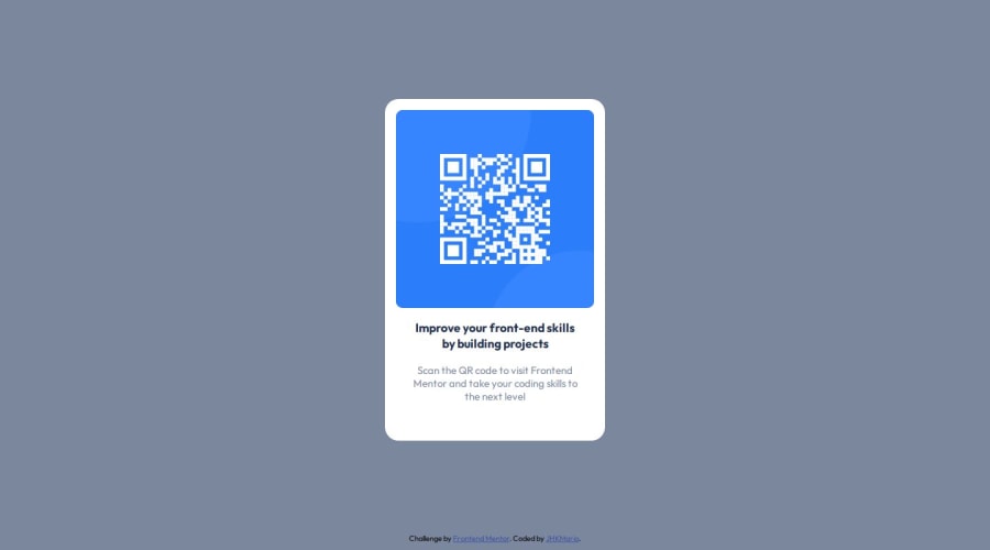
Design comparison
SolutionDesign
Solution retrospective
What are you most proud of, and what would you do differently next time?
The most interesting thing was using figma as a helper in the design. In the next projects I would like to use JS as a tool
What challenges did you encounter, and how did you overcome them?Mostly the size of the main card and the qrcode image scale
What specific areas of your project would you like help with?Just checking if it was a good implementation of the challenge
Community feedback
- @SoupmyPosted 9 months ago
It was long to make it look good on all range of screen sizes and get approximately the good card size, but the final project looks pretty good.
0
Please log in to post a comment
Log in with GitHubJoin our Discord community
Join thousands of Frontend Mentor community members taking the challenges, sharing resources, helping each other, and chatting about all things front-end!
Join our Discord
