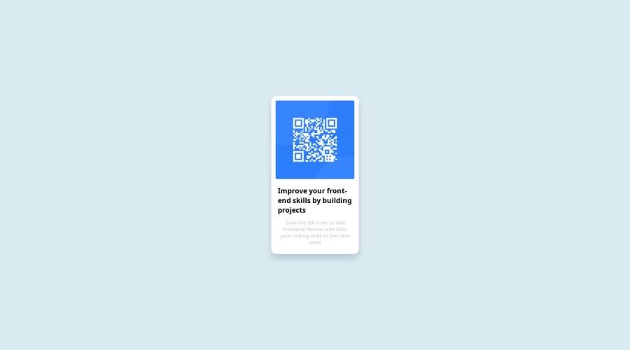
QRcode page using CSS flexbox, and Position: Fixed
Design comparison
Solution retrospective
Hey Everyone. I am absolutely new to the world of coding, but I have (hopefully) a strong interest in it. I just started learning wed development a month ago; worked on HTML and CSS, which are what I used in working on this project in VScode, then I uploaded it on Github pages. My next step is to move into Javascript. My Question is what next after that? A defined roadmap would be much appreciated PS: I'm self-learning with YouTube
Community feedback
- @danielmrz-devPosted 9 months ago
Hello @Trumpibeabuchi!
Your solution looks great!
I have a couple of suggestions (about semantic HTML) for improvement:
π First: Use
<main>
to wrap the main content instead of<div>
.Tags like
<div>
and<span>
are typical examples of non-semantic HTML elements. They serve only as content holders but give no indication as to what type of content they contain or what role that content plays on the page.π Second: Use
<h1>
for the main title instead of<div>
.Unlike what most people think, it's not just about the size and weight of the text.
- The
<h1>
to<h6>
tags are used to define HTML headings. <h1>
defines the most important heading.<h6>
defines the least important heading.- Only use one
<h1>
per page - this should represent the main heading/title for the whole page. And don't skip heading levels - start with<h1>
, then use<h2>
, and so on.
All these tag changes may have little or any visual impact but they make your HTML code more semantic and improve SEO optimization as well as the accessibility of your project.
I hope it helps!
Other than that, great job!
Marked as helpful0@TrumpibeabuchiPosted 8 months agoHi @danielmrz-dev Thank you so much for your comment.
0 - The
- @Ezekiel225Posted 9 months ago
Hello there π @Trumpibeabuchi
Good job on completing the challenge !
Your project looks really good!
I have a suggestion about your code that might interest you.
There is an very useful browser extension called Perfect Pixel that allow you compare with the design image and thus see the exact dimensions. I recommend it to you.
Also change the text-align to center
body { text-align: center; }
I hope this suggestion is useful for future projects.
Other than that, great job!
Happy coding.
Marked as helpful0@TrumpibeabuchiPosted 8 months agoHi @Ezekiel225 Thanks for the recommendation. I'll check it out ASAP
0
Please log in to post a comment
Log in with GitHubJoin our Discord community
Join thousands of Frontend Mentor community members taking the challenges, sharing resources, helping each other, and chatting about all things front-end!
Join our Discord