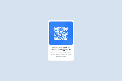
Design comparison
Solution retrospective
How easy the challenge is but I'm an overthinker so I overthink this project and instead of finishing it within 30mins - 1hr, I finished it in 1 day. Probably next time I wont overthink much on which approach should I use.
What challenges did you encounter, and how did you overcome them?One of the challenges I encounter is probably sizing the column, col-12 to narrowing and putting the component in the middle even though I have tried so many approaches. I solved the sizing by using the "rem" sizing instead of % or px when it come to width. And for centering the content, I place the "d-flex justify-content-center align-items-center" in the parent instead of child.
Community feedback
- @haquanqPosted 4 months ago
Hello @Joewanaaa
This is my opinion on how you can improve this solution:
- Page must have one
main
landmark (read more here)) which means wrap the mot important content of the page inside it. - Consider using more semantic markups instead of
div
(avoid usingdiv
when ever possible, i will explain later) such assection, article, figure,... . For example, you can choose
sectionor
article` to wrap the card (depend on what context you want to provide - is it a section or article?). - You are using headings wrong, the size of the title is irrelevant to the heading order but it rather depend on your content flow (normally you should start from
h1
toh6
and not skipping any level - such ash2
toh4
). Page must have oneh1
to give the title of the page. - You should keep your HTML structure clean and avoid unnecessary
div
wrapping. Often,div
should be used for styling purposes such as changing it's child elements layout (ex: using flexbox), you can leave child elements as it is or if the content represent as child-content you should find a proper HTML markup to wrap it (a list or section, article??) and make sure to provide a proper heading level.
Have a nice day and happy coding!!!
Marked as helpful0@JoewanaaaPosted 4 months ago@haquanq Thank you so much this is much appreciated! This is noted and will update my code applying your feedback :)
0@JoewanaaaPosted 4 months ago@haquanq hello, I tried updating my HTML, would you be so kind to give me a new feedback on this one? Thank youuu!
0@haquanqPosted 4 months ago@Joewanaaa you have already used
article
for the card and then there is asection
to wrap it's content which makeh1, p
belong to thesection
notarticle
, hence it makesarticle
meaningless.You can use
div
instead ofsection
which makes these texts belong toarticle
or consider not wrapping them inside any element at all.0@haquanqPosted 4 months ago@Joewanaaa yes, it is just a way to replace
section
in your case, for me i would remove it.0 - Page must have one
- @devvsakibPosted 4 months ago
Perfect but you can increase the height, it will be pixel perfect IG
Marked as helpful0
Please log in to post a comment
Log in with GitHubJoin our Discord community
Join thousands of Frontend Mentor community members taking the challenges, sharing resources, helping each other, and chatting about all things front-end!
Join our Discord