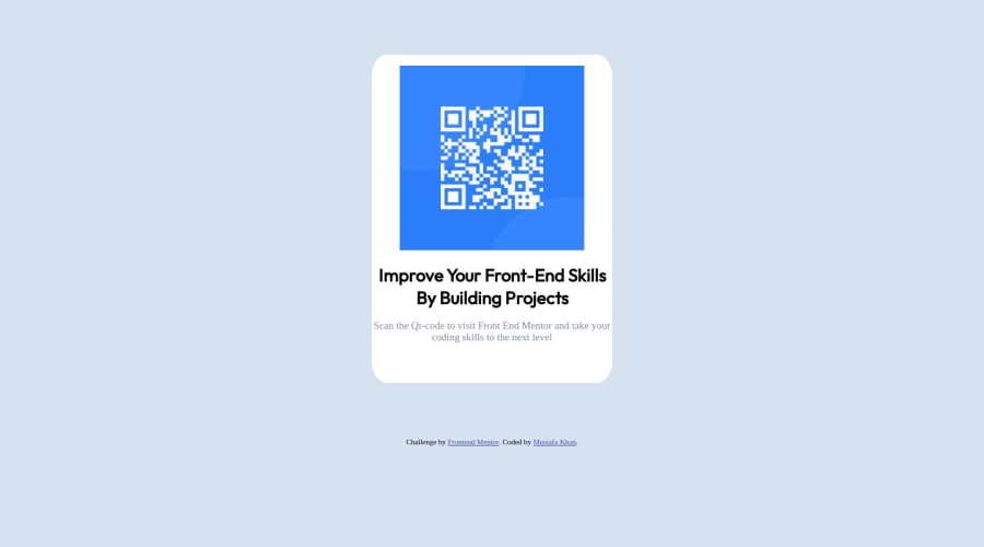
Design comparison
Community feedback
- @arfernnPosted about 1 year ago
Hi there! nice job, I've been checking your code and I wanted to give you a few comments where I think the solution could be improved
- I've noticed you centered the container class by using margins. This is normally a better way (it will find the exact center) to achieve it:
body
    {
      background-color: var(--secondary-color);
      display: flex;
      height: 100vh;
      width: 100%;
      justify-content: center;
      align-items: center;
      flex-flow: column;
    }
This approach uses flexbox, you tell the container parent (body, in this case) to act as a flexbox, and tell him to render children in a column, and to align them vertically (justify-content) and horizontally (align-items). But in order for it to work properly, you need to fix the parent's height, we choose 100vh in this case since it's the whole height of the viewport. Otherwise vertical alignment does not work.
Then, you can remove your margins.
- Also, it will be more convenient when other people read your code if you indent it consistently. I recommend using a formatter for this. VSCode comes with an integrated one, but there are more also extensions like prettier. Then its as simple as using the key combination:
- Shift + Alt + F : Windows Users.
- Shift + Option + F : macOS Users.
- Ctrl + Shift + I : Linux Users.
This will indent your whole document and fix any formatting errors.
Marked as helpful0@Mustafakhan2Posted about 1 year ago@arfernn Thanks for the tips, I appreciate your helpful comment.
0
Please log in to post a comment
Log in with GitHubJoin our Discord community
Join thousands of Frontend Mentor community members taking the challenges, sharing resources, helping each other, and chatting about all things front-end!
Join our Discord
