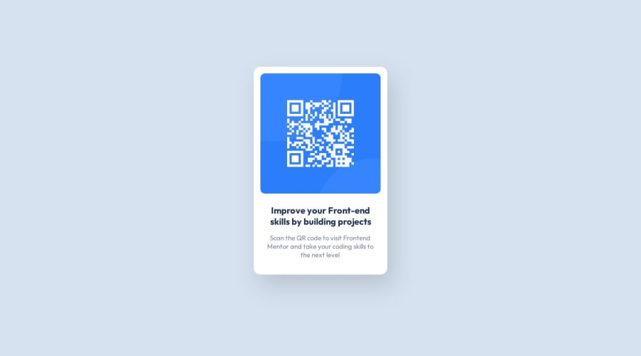
Design comparison
Solution retrospective
Hello,
Can you please give me some feedback on what I can do better/more efficient in my code?
Thanks a lot!
Community feedback
- @fa7ehPosted over 1 year ago
Great work 👍🏽
Few suggestions
You don't need to specify
display: blockeverywhere. Remove it from all elements except img and you won't see any difference.
I see you are specifying
margin: 0 autoin lot of places. I understand you are trying to center things but as Abdul mentioned in his comment, there are better tools to center elements in css.
I see you specified
paddingfor img and p element to keep them inside the wrapper. The best solution is to just give padding to wrapper itself and all elements will stay inside that padding..qr-wrap { padding: 15px; }I hope you find this useful. Best of luck.
Marked as helpful0 - @principlebrothersPosted over 1 year ago
Hello Cindy, I think you have done a good job.
One thing I learnt when I posted my is what I want to share with you to do.
Semantics
Instead of using
<div>tag around the the<img>tag, you could use<figure></figure>tag for that.Redundant code
It will be appropriate to remove redundant code from your work to make it look clean. specifically this block of code below
Again, the
alton the<img>tag should not have_or-or stuffs like that. The reason why underscores and hyphens should not be used in thealtattribute is that screen readers and other assistive technologies may interpret these characters as spaces or punctuation, which can affect the way the text is read out loud or displayed to users. For example, if the alt attribute value is "red_apple", a screen reader may interpret it as "red apple" instead of "red_apple".Finally, It will be appropriate to have the
README.mdfile update so it gives full enough information about your work.I hope it helps
Happy coding
Marked as helpful0 - @0xabdulkhaliqPosted over 1 year ago
Hello there 👋. Congratulations on successfully completing the challenge! 🎉
- I have other recommendations regarding your code that I believe will be of great interest to you.
CSS 🎨:
- Looks like the component has not been centered properly. So let me explain, How you can easily center the component without using
marginorpadding.
- We don't need to use
marginandpaddingto center the component both horizontally & vertically. Because usingmarginorpaddingwill not dynamical centers our component at all states
- To properly center the component in the page, you should use
FlexboxorGridlayout. You can read more about centering in CSS here 📚.
- For this demonstration we use css
Gridto center the component.
body { min-height: 100vh; display: grid; place-items: center; }- Now remove these styles, after removing you can able to see the changes
body {
  margin: 0 auto;
}
.qr-section {
  margin: 0 auto;
  padding-top: 150px;
}
@media (max-width: 675px) {
  .qr-section {
    margin: 80px 10px;
  }
}
- Now your component has been properly centered
.
I hope you find this helpful 😄 Above all, the solution you submitted is great !
Happy coding!
Marked as helpful0
Please log in to post a comment
Log in with GitHubJoin our Discord community
Join thousands of Frontend Mentor community members taking the challenges, sharing resources, helping each other, and chatting about all things front-end!
Join our Discord
