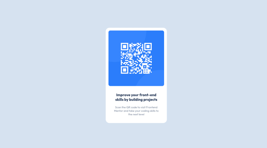
Design comparison
Solution retrospective
👋😊 Hi there! This is my first project completed on my very own, so, naturally, there are some areas i am unsure about.
-
i struggled quite a bit to centre the project. I know that developers praise
margin: 0 auto;
,however i do not feel its power, it doesnt do anything for me, so i had to use different approaches:::: .container { width: 700px; margin-left: auto; margin-right: auto;
} -------i used the same code to centre the footer (the signature), however it didint centre in the same way. i then used
.attribution { width: 700px; margin: 0 auto; text-align: center; } ,but it still wasnt ideal as both contents werent centred equally.
Also, what do you think about HTML element <centre> ? would it be appropriate in this or any other case?
I would appreciate if someone would advise on the best approach when facing this task. -
regarding responsive design (to show it on 375px screen) i could have used the approach @media (max-width 400px) and then select element by element making the sizes smaller. However, i feel there should be a better, faster way to solve this matter. I went through numerous YouTube videos and StackOverflow articles without finding an answer. This frustrated me immensely, i just KNOW that there should be a sophisticated way for this, i just cant find it😅 i am dreading for alternative suggestions, please.
-
CSS selectors hierarchy. I am aware that some programmers lay down their selectors alphabetically (1st the elements, 2nd ids, 3rd classes, of course). However, it is intuitive for me to lay selectors from top to bottom as they correspond with the project layout (gosh, i hope i am articulating it clearly enough?). I guess, what im asking is, do you pay attention in which line you type your selectors in. Is it a matter of preference or there are more acceptable hierarchy to write a cleaner code?
-
Taking into consideration current job market, which approach would make the employer the happiest? Maybe to use SASS instead of CSS? some other fancy approach in comparison to HTML and CSS? Or this project is not big enough to play with anything else but HTML and CSS?
If you could share some of your insights, i would greatly appreciate it!
Many thanks,
Greta
Community feedback
- @TH3RIVPosted about 2 years ago
Hey, it seems like everything is clean and readable to me. Great job. Now considering your issues:
- There's a very easy way to center your project by using a flexbox on a parent container:
body { min-height: 100vh; display: flex; align-items: center; justify-content: center; }
Basically whatever is between the
<body>YOUR CONTENT</body>
tags will be displayed in the center of the parent. And then you can just usemargin: 0 auto;
on the card container to make sure the margins adjust to keep it in the center horizontally.- Now when it comes to responsiveness I found that it's good to use percentages over the fixed values, I just started learning and using that myself so I am no expert.
Hope this helps a little at least. :)
Tikiuos angliškai tiks, kad bet kas užėjęs galėtų suprasti. :)
Marked as helpful1@great1gretaPosted about 2 years ago@TH3RIV Hey, Saulius! Many thanks for your reply! 😊
Of course, flexbox! it didint pop into my head as its just one item and not many to display.
I will look up the percentages approach, to be honest was not aware of it.
Ačiū 😊 linkiu tau smagaus ir sklandaus programavimo!
0 - @engelbrechtzPosted about 2 years ago
Hey, how's it going? 🙏
Amazing Job!!!
You did good. Html is clean, css is clean. Here are some changes I would recommend 🧐
Changes To Consider
- Use the root selector in css. This will allow you to create variables to call the same name without copying the same color code again and again. It saves time :)
style.css file
:root{ --variable-name-example: white; --background: blue; } body{ background-color: var(--background); }
index.html file
<body> <h1>I have a blue background</h1> </body>
My Insights HTML and CSS are formally known as markup languages that everyone should master at a begineer level before jumping on to sass. SASS however, saves time when writing styles because you use less repitation of classes which is annoying. Sass is techniqully a programming language due to the fact the it introduces programmable logic, but for web applications. Using stuff like sass variables
$variable: white;
functions@function(){}
, conditional statements,@if (variable === "red"){}
and so on. You can use sass in any project even if it's small because it's quicker in my opinion.You can check out my front-end challenges that are done in sass for examples :) My Github Challenges
Overall, You did a great job! 👏
Regards, Declan
Marked as helpful1@great1gretaPosted about 2 years ago@DevDeclann Many thanks, Declan! Yes, you are totally right, i should be using :root selector, i will definitely implement it on my further projects.
0
Please log in to post a comment
Log in with GitHubJoin our Discord community
Join thousands of Frontend Mentor community members taking the challenges, sharing resources, helping each other, and chatting about all things front-end!
Join our Discord