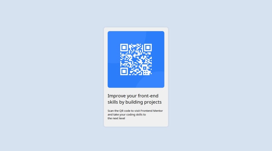
Design comparison
SolutionDesign
Community feedback
- @AkoToSiJeromeEhPosted 7 months ago
Hey ! great work out there i just notice that the content or the text is not position center as the original design has , to center it you can use text-align : center in .main element also you need to add a css font-weight : 800 on h2 to make it bold same as the original design has . that's all happy coding !
.main {
  width: 300px;
  margin: 0 auto;
  padding: 20px;
  background-color: #f0f0f0;
  border-radius: 10px;
  box-shadow: 0 0 10px rgba(0, 0, 0, 0.1);
  text-align: center; // add this
  line-height: 1.3; // add this and you can adjust this
}
Marked as helpful1@ZENMODE281Posted 7 months ago@AkoToSiJeromeEh Thanks alot for helping me out man
0
Please log in to post a comment
Log in with GitHubJoin our Discord community
Join thousands of Frontend Mentor community members taking the challenges, sharing resources, helping each other, and chatting about all things front-end!
Join our Discord
