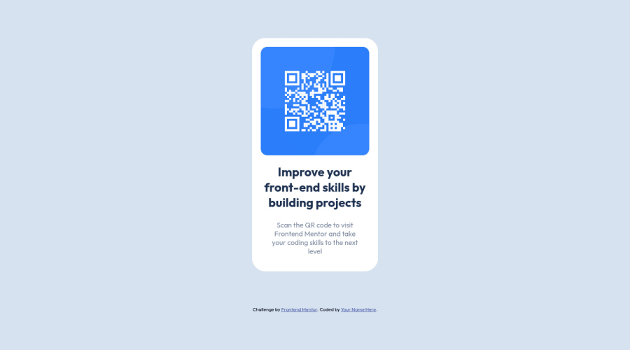
Design comparison
SolutionDesign
Community feedback
- @denieldenPosted over 2 years ago
Hi Pai, I took some time to look at your solution and you did a great job!
Also I have some tips for improving your code:
- add
maintag and wrap the card for Accessibility - remove all unnecessary code, the less you write the better as well as being clearer: for example the
divcontainer of image - to make it look as close to the design as possible set
width: 20remto.qrcodeclass and decrease the font size of all text
Overall you did well 😉
Hope this help and happy coding!
Marked as helpful1 - add
Please log in to post a comment
Log in with GitHubJoin our Discord community
Join thousands of Frontend Mentor community members taking the challenges, sharing resources, helping each other, and chatting about all things front-end!
Join our Discord
