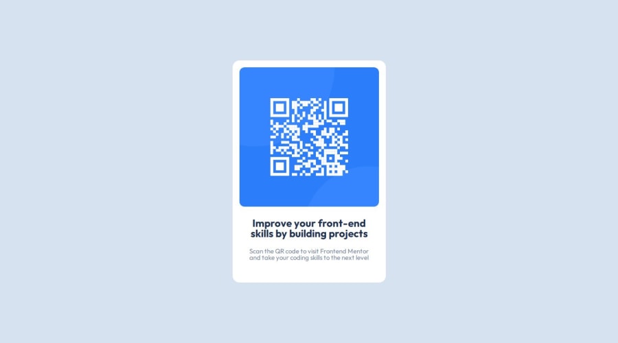
Not Found
Not Found
Not Found
Not Found
Not Found
Not Found
Not Found
Not Found
Not Found
Not Found
Not Found
Not Found
Not Found
Not Found
Not Found
Not Found
Not Found
Not Found
Not Found
Not Found

Submitted

QR-Code Components

Rodā€¢ 90

@RodRyan19

Desktop design screenshot for the QR code component coding challenge

This is a solution for...

  • HTML
  • CSS
1newbie
View challenge

Design comparison


SolutionDesign

Solution retrospective


This is my first project here and didn't really encounter any difficulty but I would love some feedback to improve and what to change to a proper front end standard. Thanks!

Community feedback

Daniel šŸ›øā€¢ 44,230

@danielmrz-dev

Posted

Hello @RodRyan19!

Your solution looks great!

I have a suggestion for improvement:

  • Use <main> to wrap the main content instead of <div>.

šŸ“Œ Think of <div> and <span> in HTML like plain boxes or placeholders. They're handy for holding content, but they don't tell us anything about what's inside or what it's meant for on the webpage.

This tag change does not impact your project visually and makes your HTML code more semantic, improving SEO optimization as well as the accessibility of your project.

I hope it helps!

Other than that, great job!

1
Hassan Moatazā€¢ 1,860

@hassanmoaa

Posted

Hello @RodRyan19!

Great Job solving the challenge mate congrats šŸŽ‰

Some suggestions for improvements.

For the font-size it's is recommended to use rems and ems.

font-size: 13px;

i see you using pixels for many elements, never use pixels for font-sizes in any element, here's why:

Certain font-related CSS properties will render your site completely inaccessible if their value is declared using pixels even once.

Which properties are affected?

All of these properties must never ever be declared in pixels:

  • font-size
  • line-height
  • letter-spacing

If you've used pixels to define any of the above style properties, these will not respect the user's font size preferences!

You should use ems, and rems for font-sizes would be better

This article may help:

(https://fedmentor.dev/posts/font-size-px/)

āž–āž–āž–āž–āž–āž–āž–āž–

Use <main> to wrap the main content instead of <div>. * šŸ“Œ Tags like <div> and <span> are typical examples of non-semantic HTML elements. They serve only as content holders but give no indication as to what type of content they contain or what role that content plays on the page. This tag change does not impact your project visually and makes your HTML code more semantic, improving SEO optimization as well as the accessibility of your project.

āž–āž–āž–āž–āž–āž–āž–

And an extra tip

Heading is defined with <h1> to <h6> tags. It is important to use headings to show the HTML document structure.

<h1> headings should be used for main headings, followed by <h2> headings, then <h3>, and so on up to <h6>
  • You could also select all element/tags by using * (all-selector) either than selecting all elements by their tag name.

Other than that you're good, keep up the good work!

1
Alok Sumanā€¢ 2,380

@Alokray007

Posted

Hello there! šŸ™‹šŸ½ā€ā™‚ļø

Your solution looks excellent!

I have a suggestion about your code that might interest you:

šŸ“Œ If you don't have the Figma design files, I recommend using a browser extension called Perfect Pixel.

It allows you to compare your finished project with the design images that come along when you download the project and check the (almost exact) dimensions. It's very useful!

I hope it helps you in future projects! šŸ˜Š

Other than that, great job!

1
Osman Bayā€¢ 690

@osmanbay90

Posted

Great job on completing the Frontend Mentor challenge! Your project shows promise, but here are some areas where you could make improvements in your HTML and CSS:

1. Semantic HTML: Ensure you use appropriate HTML elements for each piece of content. For instance, use <main> tags and wrap cards to improve accessibility. Replacing the first child <div> of the <body> with <main> can enhance the structure.

2. Remove Unnecessary Code: Less is more! Eliminate any unnecessary code. For example, remove HTML comments and avoid redundant CSS properties. Clarity and simplicity are key.

3. Responsive Images: Give images a max-width of 100% to ensure responsiveness across different devices. Also, consider adding a border-radius value for a polished look.

4. Typography Consistency: Maintain consistent font sizes, text alignment, and margins. For instance, set h1 and p font size to 15px (0.9375rem), align text to the center, and apply consistent margins.

5. Flexbox and Grid: Explore these layout techniques to create responsive designs. Flexbox is great for one-dimensional layouts, while CSS Grid handles two-dimensional layouts effectively.

6. Accessibility: Use semantic elements like <nav>, <article>, and <section> to improve screen reader compatibility. Add alt attributes to images for better accessibility.

7. CSS Variables: Leverage custom properties (CSS variables) for consistent color schemes, font sizes, and spacing. This makes it easier to maintain and update styles.

8. Organized CSS: Group related styles together. Use separate CSS files for different components or sections. Avoid inline styles whenever possible.

9. Mobile-First Approach: Start designing for mobile screens first, then progressively enhance for larger screens. This ensures a better user experience across devices.

10. Browser Compatibility: Test your design on different browsers (Chrome, Firefox, Safari, Edge) to ensure consistent rendering. Use vendor prefixes for CSS properties if needed.

Remember, practice makes perfect! Keep refining your skills by tackling more challenges on Frontend Mentor. Happy coding! šŸš€

0

Please log in to post a comment

Log in with GitHub
Discord logo

Join our Discord community

Join thousands of Frontend Mentor community members taking the challenges, sharing resources, helping each other, and chatting about all things front-end!

Join our Discord