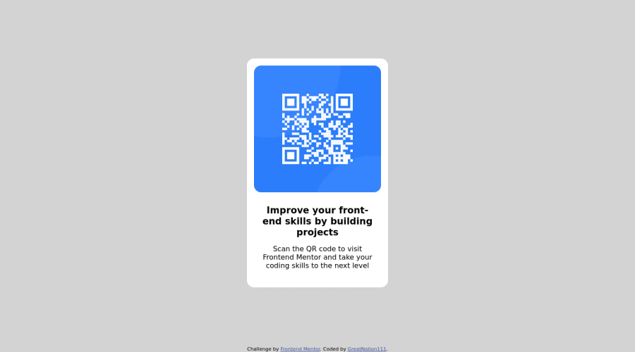
Design comparison
Solution retrospective
I still don't have enough understanding about how "rems" work At first i found it hard to put the image and the main texts in a container, then resizing the image and all that i couldn't find the specific number they need just tried anything and it worked
Community feedback
- @john-miragePosted about 2 years ago
Hello,
- A size defined in REM will be relative to the font-size of the root element which is html.
- A size defined in EM will be relative to the font-size of its closest parent.
html
<div class="parent"> <p class="paragraph">text</p> </div>
Example of REM size:
html { font-size: 16px; } .parent { font-size: 10px; } .paragraph { font-size: 1rem; }
Result: In this example the paragraph will have a size of One time the font size of the HTML font size (1 * 16 = 16px);
Example of EM size:
html { font-size: 16px; } .parent { font-size: 10px; } .paragraph { font-size: 1em; }
Result: In this example the paragraph will have a size of One time the font size of the closest parent font size (1 * 10 = 10px);
Marked as helpful0 - @correlucasPosted about 2 years ago
👾Hi @GreatNation111, congratulations on your first solution!👋 Welcome to the Frontend Mentor Coding Community!
Great solution and a great start! From what I saw you’re on the right track. I’ve few suggestions for you that you can consider adding to your code:
Here's one explanation about rem:
Pixel are absolute units, meaning, that 1px corresponds to a fixed physical size(depending on different screen resolutions). Now a fixed value seems like a designer's dream, total control as we are designing at 1x in Figma! Fixing everything so it looks perfect! However, using px(besides other issues) can create serious accessibility barriers such as overruling the font size preferences set by users.
Source:
https://uxdesign.cc/why-designers-should-move-from-px-to-rem-and-how-to-do-that-in-figma-c0ea23e07a15
It is not advisable to use IDs as CSS selectors because if another element in the page uses the same/similar style, you would have to write the same CSS again. Even if you don't have more than one element with that style right now, it might come later.
✌️ I hope this helps you and happy coding!
Marked as helpful0 - @nzewiPosted about 2 years ago
Hello,
Styling
- It would be good if you used classes to style your components instead of IDs, to make them more reusable.
- It is best to avoid styling elements if you can, to avoid issues with specificity, especially in larger projects. You can give them classes and style with the classes instead.
- Put more effort into paying attention to the details of the design to implement the right colors.
0@GreatNation111Posted about 2 years ago@nzewi thanks for the correction i will work on it
0
Please log in to post a comment
Log in with GitHubJoin our Discord community
Join thousands of Frontend Mentor community members taking the challenges, sharing resources, helping each other, and chatting about all things front-end!
Join our Discord