Design comparison
Solution retrospective
- What's the easiest way to get a page to be responsive to mobile and desktop.
- I hope its better now.
Community feedback
- @KCOJAVAPosted over 2 years ago
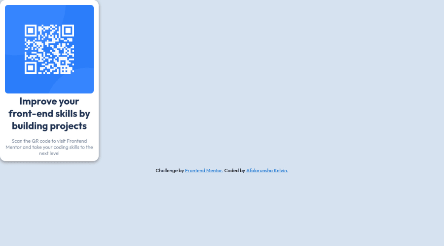
Hi Kelvin. You have done well. There are several ways to center a content but I will suggest you use Display: Grid, Height:100vh, then Place items: Center.
Marked as helpful1@dripping-codePosted over 2 years ago@KCOJAVA Thanks have make it centered with flex. But thanks for your help.
0 - @correlucasPosted over 2 years ago
👾Hi Kelvin, congratulations for your first solution!👋 Welcome to the Frontend Mentor Coding Community!
Amazing solution! I’ve just opened the solution’s live site and I liked the job you’ve done a lot. I’ve some suggestions for you:
Something I've noticed in your code is that in many occasions you've added some
<div>to wrap contents that don't really need to be inside of a div block. Note that for this challenge all you need is a single block to hold all the content, can be<div>or<main>if you want to use a semantic tag to wrap the content, the cleanest structure for this challenge is made by a block of content with div/main and all the content inside of it (img, h1 and p) without need of any other div or something. See the structure below:<body> <main> <img src="./images/image-qr-code.png" alt="Qr Code Image" > <h1>Improve your front-end skills by building projects</h1> <p>Scan the QR code to visit Frontend Mentor and take your coding skills to the next level</p> </main> </body>✌️ I hope this helps you and happy coding!
Marked as helpful0 - @BginelPosted over 2 years ago
Hi, Kelvin. There are several ways to center the box, an example would be using "margin:", but for us who are starting the best way is using the "Flexbox" method. There are several interesting tutorials on youtube, it's worth watching some. Hope I helped and keep training.
Marked as helpful0@dripping-codePosted over 2 years ago@Bginel Thanks a-lot. I would surely keep watching videos.
0 - @tltd0807Posted over 2 years ago
Hello Kelvin, congratulations on your new solution! -for the content in the middle, try to set the width: 100% for the .place or the body
Marked as helpful0@dripping-codePosted over 2 years ago@tltd0807 Thanks a-lot. This really help met. I have centered it.
0 - @king-oldmatePosted over 2 years ago
There are a couple of ways to center align content. What would probably be best in this situation is to use flexbox {display: flex; justify-content: center; align-items: center}. I really recommend you search and practice how to achieve this, and perhaps even resubmit this challenge.
@media queries are generally how one would create a responsive page, but that's not really applicable on this challenge.
Marked as helpful0@dripping-codePosted over 2 years ago@king-oldmate thanks alot.. but i used them same way to center it but probably i didn't place it well...
0
Please log in to post a comment
Log in with GitHubJoin our Discord community
Join thousands of Frontend Mentor community members taking the challenges, sharing resources, helping each other, and chatting about all things front-end!
Join our Discord
