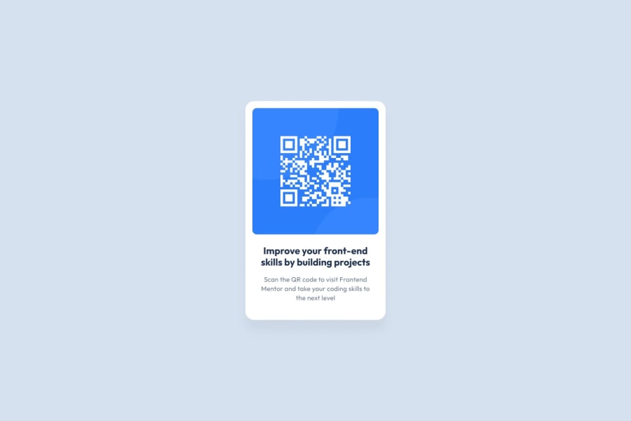
Design comparison
SolutionDesign
Community feedback
- @SafeNSound95Posted about 1 year ago
good job, but I'd add more padding between the QR image and the white box. also it's better to adhere to the design guide provided in the challenge.
Marked as helpful1
Please log in to post a comment
Log in with GitHubJoin our Discord community
Join thousands of Frontend Mentor community members taking the challenges, sharing resources, helping each other, and chatting about all things front-end!
Join our Discord
