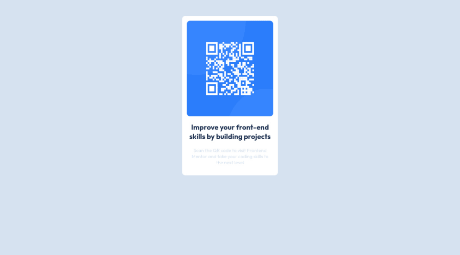
Design comparison
SolutionDesign
Solution retrospective
Overall review of the design that I made? How should I make this code more readable? What are the areas that I need to improve?
Community feedback
- @RioCantrePosted almost 3 years ago
Hello there! Nice work with this project. Viewing at your solution, I would suggest the following for you...
- Wrap the
.containerwith specific tag likemainfor readability - Adjust the color value of the
attributionintocolor: hsla(227, 10%, 71%, 1);
Overall, you did well and Keep it going!
Marked as helpful0 - Wrap the
Please log in to post a comment
Log in with GitHubJoin our Discord community
Join thousands of Frontend Mentor community members taking the challenges, sharing resources, helping each other, and chatting about all things front-end!
Join our Discord
