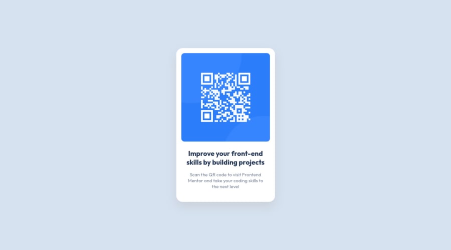
Design comparison
Solution retrospective
I think that my solutions looks very similar to the original but next time I will check better the sizes
What challenges did you encounter, and how did you overcome them?I had problems to undrstand the correct sizes, but with Figma i solved this problem
What specific areas of your project would you like help with?Landmarks
Community feedback
- @giorgiagalbullicavazziniPosted 8 months ago
Hi, Christian.
Landmarks are essentially a way for non-sighted individuals to navigate websites. Actually, screen readers employ them to help users move between different sections.
You may have noticed that the landmarks tags are pretty self-explanatory: a header is the "heading" part of the page, with the website name, logo, and so on that need to be the same for every website page; the nav is the navigation menu you can use to navigate to the different content provided by the website; the main tag refers to the main section of your page; the footer is the opposite of the header and is placed at the bottom of the screen and, like the header, is the same for every page and contains privacy policies, credit info, and so on.
So, basically, the landmarks' role is to inform screen reader users about which content is located where.
Marked as helpful1
Please log in to post a comment
Log in with GitHubJoin our Discord community
Join thousands of Frontend Mentor community members taking the challenges, sharing resources, helping each other, and chatting about all things front-end!
Join our Discord