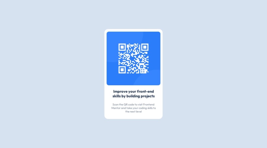
Design comparison
Solution retrospective
Improved my solution. Any suggestions are welcome
Community feedback
- @0xabdulkhaliqPosted over 1 year ago
Hello there 👋. Congratulations on successfully completing the challenge! 🎉
- I have other recommendations regarding your code that I believe will be of great interest to you.
HTML 🏷️:
- This solution may cause accessibility errors due to lack of semantic markup, which causes lacking of landmark for a webpage and allows accessibility issues to screen readers, due to accessibility errors our website may not reach its intended audience, face legal consequences, and have poor search engine rankings, highlighting the importance of ensuring accessibility and avoiding errors.
- What is meant by landmark ?, They used to define major sections of your page instead of relying on generic elements like
<div>or<span>. They are use to provide a more precise detail of the structure of our webpage to the browser or screen readers
- For example:
- The
<main>element should include all content directly related to the page's main idea, so there should only be one per page - The
<footer>typically contains information about the author of the section, copyright data or links to related documents.
- The
- So resolve the issue by replacing the
<div class="container">element with the proper semantic element<main>in yourindex.htmlfile to improve accessibility and organization of your page
COMPONENT MEASUREMENTS 📐:
- The
width: 100vwproperty for.containeris not necessary. because it's a block level element which will take the full width of the page by default.
- So feel free to remove
width: 100vwstyle rule from.containerthis will help you to write efficient code and makes your code more reusable.
.
I hope you find this helpful 😄 Above all, the solution you submitted is great !
Happy coding!
Marked as helpful1@Danish49Posted over 1 year agoThanks for your precious suggestion i will keep this in mind next time@0xAbdulKhalid
0 - @HassiaiPosted over 1 year ago
Replace <div class="container"> with the main tag and wrap
Improve your front-end skills by building projectsin <h1>,<h1> Improve your front-end skills by building projects </h1>to make the content/page accessible. click here for more on web-accessibility and semantic htmlEvery html must have <h1> to make it accessible. Always begin the heading of the html with <h1> tag wrap the sub-heading of <h1> in <h2> tag, wrap the sub-heading of <h2> in <h3> this continues until <h6>, never skip a level of a heading.
there is no need to give the body overflow-x and to style .container.
To center .qr-box on the page using flexbox, add min-height:100vh; display: flex; align-items: center: justify-content: center; to the body
body{
min-height: 100vh;
display: flex;
align-items: center;
justify-content: center;
}
For a responsive content,
- Give .container a fixed max-width value, a padding value for all the sides
max-width: 320px which is 20rem/em padding:16px which is 1rem/em, a background-color of white and a border-radius value. the rest are not needed. - Give the img a max-width of 100% and a border-radius value, the rest are not needed.
Give h1 and p the same margin-left, margin-right and margin-top values. Give p a margin bottom value.
Use relative units like rem or em as unit for the padding, margin, width values and preferably rem for the font-size values, instead of using px which is an absolute unit. For more on CSS units Click here and here
Hope am helpful.
Well done for completing this challenge. HAPPY CODING
Marked as helpful0 - Give .container a fixed max-width value, a padding value for all the sides
Please log in to post a comment
Log in with GitHubJoin our Discord community
Join thousands of Frontend Mentor community members taking the challenges, sharing resources, helping each other, and chatting about all things front-end!
Join our Discord
