

Design comparison
SolutionDesign

Solution retrospective
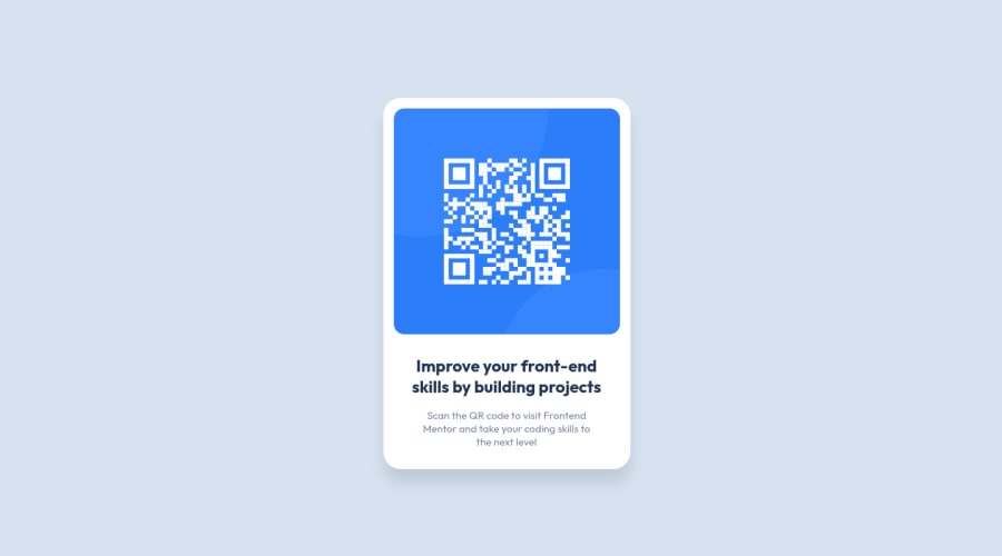
Hello everyone! This is my first official Front End Mentor project completed. It wasn't difficult but I did have a little problem finding the "perfect" size for my container.
If anyone has any tips on helping me find the best size for my project containers for the future Front End Projects. I am also welcoming any feedback on how I can improve. Thank you in advance!
Community feedback
Please log in to post a comment
Log in with GitHubJoin our Discord community
Join thousands of Frontend Mentor community members taking the challenges, sharing resources, helping each other, and chatting about all things front-end!
Join our Discord