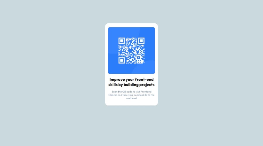


Design comparison
SolutionDesign

Solution retrospective
What are you most proud of, and what would you do differently next time?
.
What challenges did you encounter, and how did you overcome them?.
What specific areas of your project would you like help with?.
Please log in to post a comment
Log in with GitHubCommunity feedback
- @grace-snow
Well done on improving the html in this. Now you need to finish improving the CSS.
- Get into the habit of including a full modern css reset at the start of the styles in every project. Andy Bell or Josh Comeau both have good ones you can look up and use.
- if using flex on the body don't forget to set the direction to column.
- to center the component on the page you'll need to give body a min-height of 100vh (or svh). By default the body will only be as tall as it's content so you need to tell it to be at least as tall as the screen.
- remove the huge margin off the component. That is not how you center something or build a layout. The component needs a little padding on all sides (or the body could have a little padding on all sides) so the component never hits the screen edges.
- the component does not need a min height.
- the image should not have a width or height. All it needs is the border radius and the properties that are usually part of the css reset:
display: block; max-width: 100%;. You can optionally give the image an aspect ratio property set to 1. - style using classes not element selectors as much as possible. Usually element selectors are only used at the start of a big project's stylesheet to set sensible defaults. After that and for all components single class selectors are used.
- I am confused by this whether you're treating main or article as your component. I think it should be what you have as article... But that doesn't have the white background. Very confusing. The component shouldn't have extra inner containers with margins... Choose one element for this component (the card) and stick with it.
- font size must never be in px.
Marked as helpful

Join our Discord community
Join thousands of Frontend Mentor community members taking the challenges, sharing resources, helping each other, and chatting about all things front-end!
Join our Discord