Design comparison
Solution retrospective
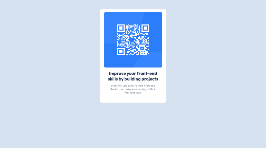
I have completed my first challenge and hoping for feedback to improve my mistakes.
Community feedback
- @Sumit640Posted almost 3 years ago
Good work. My suggestion would be, instead of defining separate h2 for above lines, you can use single h2 for both and change the width of h2 element with respect to the width of the card.
1@Ayush1MPosted almost 3 years ago@Sumit640 Thank you sumit for your valuable feedback. I will remember this next time. Actually I was just trying new things and will it work or not but eventually, they worked. But it's not the right thing and I will keep this in mind. Thank you.
1 - @DrMESAZIMPosted almost 3 years ago
hi @Ayush1M . Okay for the First challenge I believe you did good job . I would want you to place your project at the center of the screen , to do that I suggest you add the CSS properties
text-align :center; justify-content: center;
to the body in the file index.css. Please have a look at how I did so on the same challenge on my YouTube channel from 4min 25sec to 5min 45sec part of the video.
YouTube video link: https://www.youtube.com/watch?v=biSS7pIEx6A&t=476s
0
Please log in to post a comment
Log in with GitHubJoin our Discord community
Join thousands of Frontend Mentor community members taking the challenges, sharing resources, helping each other, and chatting about all things front-end!
Join our Discord
