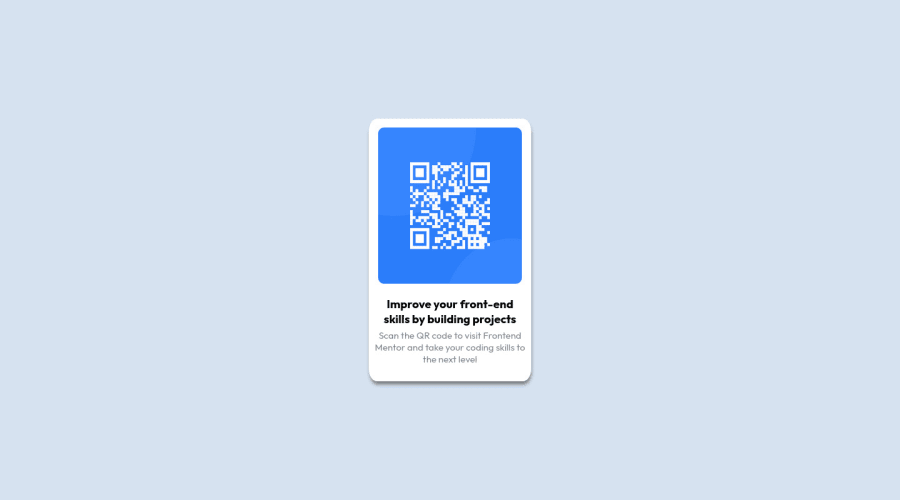
Design comparison
SolutionDesign
Community feedback
- @MelvinAguilarPosted about 2 years ago
Hi @naida1210 👋, good job completing this challenge, and welcome to the Frontend Mentor Community! 🎉
I have some suggestions you might consider to improve your code:
- Use the
<main>tag to wrap all the main content in your solution instead of using<div class="container">.
- Additionally, you can use the
<article>tag instead of div to the container card:<div class="card">.
- Use
<footer>instead of<div class="attribution">. The<footer>element contains authorship information.
- To make alternative texts more worthwhile, add descriptive text to the alt attribute of the QR image to explain what the QR image does. Upon scanning the QR code, you will be redirected to the frontendmentor.io website, so an example of alternative text would be "QR code to frontendmentor.io". You can read more about alternative text here.
- Instead of using pixels in font size, use relative units of measure like
remorem. The font size in absolute length units (px) does not allow users with limited vision to change the text size in some browsers. Reference.
- Always avoid skipping heading levels; Always start from
<h1>, followed by<h2>, and so on up to <h6> (<h1>,<h2>,...,<h6>).
- Use an h1 tag for your solution. The
<h1>element is the main heading on a webpage, also, there should only be one<h1>tag per page. Swap the<h2>tag with<h1>.
- You can use a single <h1> element and reduce the size of the text, and if you want to do a line-break increase the margins.
Above all, the project is done well👏. I hope those tips will help you! 👍
Good job, and happy coding! 😁
Marked as helpful1 - Use the
Please log in to post a comment
Log in with GitHubJoin our Discord community
Join thousands of Frontend Mentor community members taking the challenges, sharing resources, helping each other, and chatting about all things front-end!
Join our Discord
