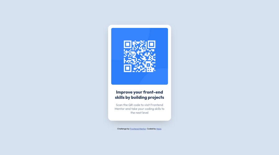
Design comparison
Solution retrospective
Second frontend mentor project, this one did not take that long to build, but as always I had fun building it, feedback would be greatly appreciated on how I could of done something better. Thank you! :)
Community feedback
- @Tux3er-IsmaPosted almost 2 years ago
Hi Heza!!!
Congrats for completing this challenge, you have done it very well 👍🏻🎉
I have reviewed your code and there are some tips for youe next project 💡:
- Your reset CSS is good but I recomend you another that I think is better. normalize.css 📖
For being your second challenge I am very suprised, you have done it fantastic 👍🏻🎉
I hope this comment will help you in your next challenge or project 😉
And don't forget to continue coding ⌨️👍🏻🖐🏻
Marked as helpful2 - @ScottburgPosted almost 2 years ago
Replace <div class="attribution"> with the footer tag to fix the accessibility issue. click here for more on web-accessibility and semantic html.
Only other minor point is that the original card has a light box-shadow property which helps the card to pop out the page a bit more.
Great job, keep it up!
Marked as helpful1 - @HassiaiPosted almost 2 years ago
Wrap <div class="attribution"> within the footer tag to fix the accessibility issue.
To center .content on the page using grid, add min-height: 100vh to the body.
There is no need to give the body a padding value.
Give h1 and p the same font-size of 0.9375rem, which is 15px.
Hope am helpful.
Well done for completing this challenge. HAPPY CODING
Marked as helpful1
Please log in to post a comment
Log in with GitHubJoin our Discord community
Join thousands of Frontend Mentor community members taking the challenges, sharing resources, helping each other, and chatting about all things front-end!
Join our Discord